Compagnie is a digest of various French and Swiss wood type Grotesques — or Antiques as they are natively called — from the second half of the 19th century. In loose dialogue with its ancestors, this trio embraces the exceptions rather than the norm, and moulds these into a conglomerate of extreme contrasts.


Specimen


Technical information
Ellmer Stefan
3 styles
OTF, WOFF2 (cubic)
July 2020
1.2 (20250525)
Ellmer Stefan
3 styles
OTF, WOFF2 (cubic)
July 2020
1.2 (20250525)
Opentype features
¿QUE?
12+3≠45
USD 100
E=mc2
C24
1/2 3/4
21/45
1a 2o
Plane
Inital
Rome
Sound
Hosting
Undo
gyro?
Secular 235 Greys?
Sassy
3,1415
½ tbsp. ¼ wine
1 2 3 4
Context
Compagnie is a digest of various French and Swiss wood type Grotesques — or Antiques as they are natively called — from the second half of the 19th century. In loose dialogue with its ancestors, this trio embraces the exceptions rather than the norm, and moulds these into a conglomerate of extreme contrasts.
Following down the rabbit hole opened by the extensive research of Éric Nunes, the influences span from the French manufacturer E. Ploquin (c. 1883) to the Swiss Martin & Coderey (c. 1885) and back to France to the work of Bonnet & Cie. (1860) and Gaston Dubosc (1865). The featured Antiques show a wide array of stylistic variants and geometric structures; among them various idioms that were canonized in the course of the 20th century.
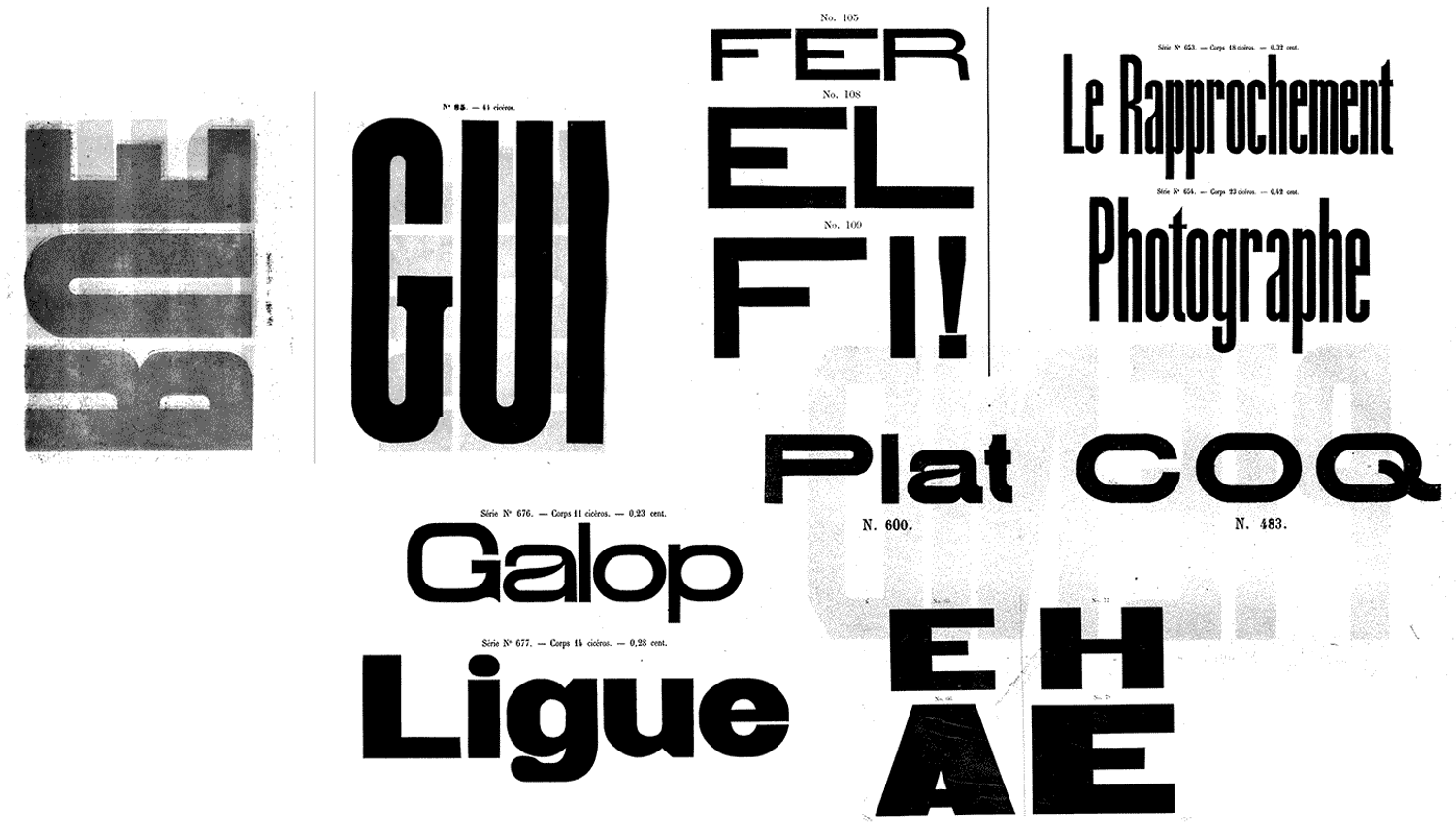
What might appear as primitive and aesthetically clumsy to the well-trained, contemporary eye, is indeed an embodiment of the raw force at work in the industrial production process. Here, the letter shapes are envisioned simultaneously to their making, resulting in a considered yet immediate expression. It is this urgency that has been the guiding principle in the development of Compagnie. In an act of conscious translation, the crudity of the originals becomes an aesthetic in its own right. This faux-naïvité is exemplified by the absence of overshoots, the lack of optical compensation and the occasional collision with the edge of the non-existent wood block.
As such, Compagnie translates the notion of defamiliarization (or ostranenie, the original Russian term) theoretically applied by Viktor Shklovsky to poetic language, into the realm of type design. By amplifying the unnatural naturalness of expression, the invisibility of type is neutralized by its own means. This exposure of uncertainty opens up criticism and questions the authority claimed by other, more confident styles in the Sans Serif typeface genre.

Compagnie’s unsophisticated simplicity is a celebration of conflicting desires. Indulging in group dynamics of all sorts — both at style and family level — it shines with structural weirdness rather than mere quriky [sic!] details. This trifold, brought together not by a logical relationship but by associative affinity, makes for strikingly graphic combinations and performs — to paraphrase Nick Sherman — confidently sharp in its awkwardness.
In use


By Submachine
License
By proceeding you agree to comply with the End User License Agreement (EULA)
