Custom Type for Coop Norge
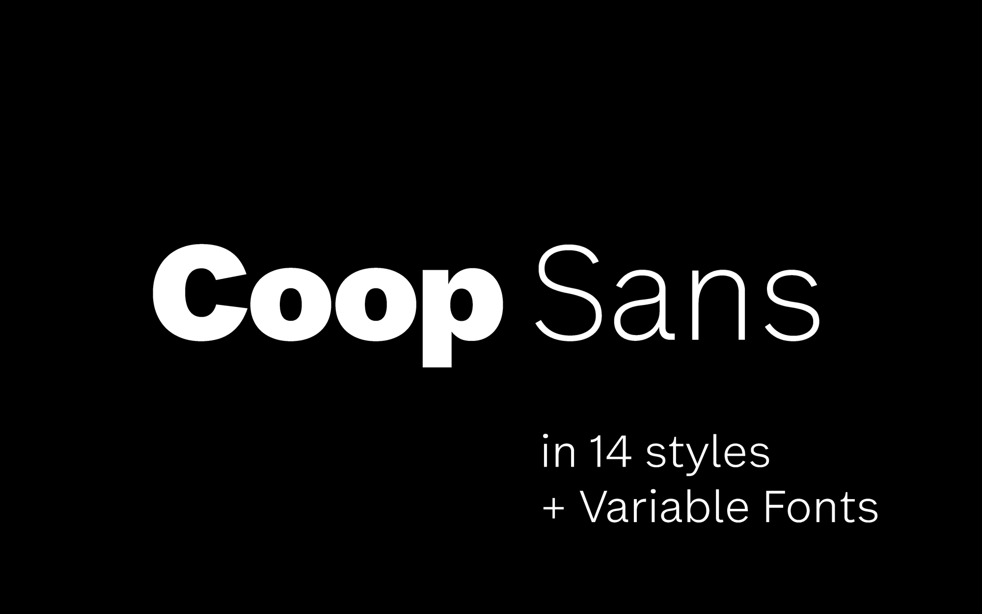
The typeface family Coop Sans was exclusively designed for Coop Norge in close collaboration with Erik Johan Worsøe Eriksen at ANTI Oslo.
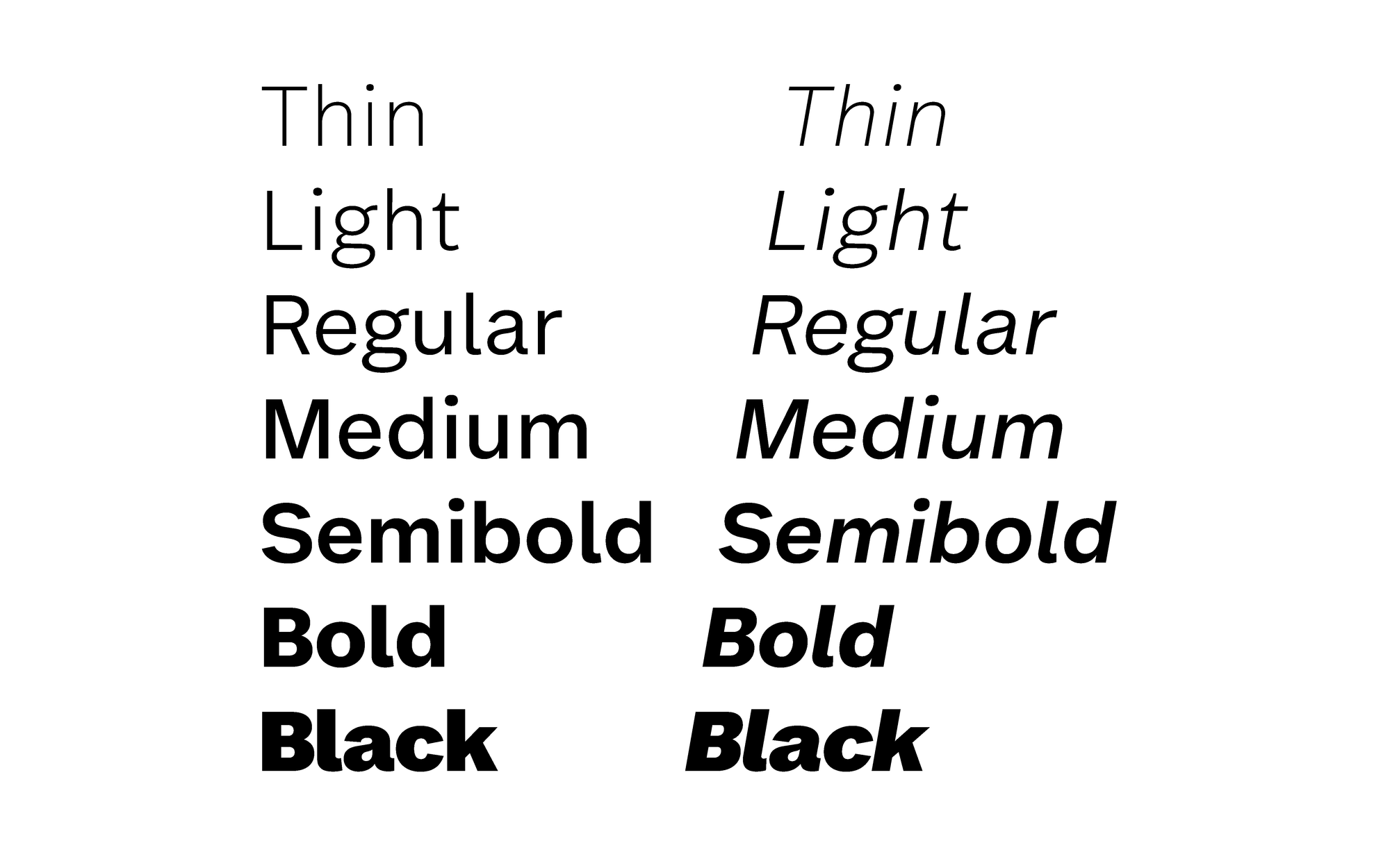

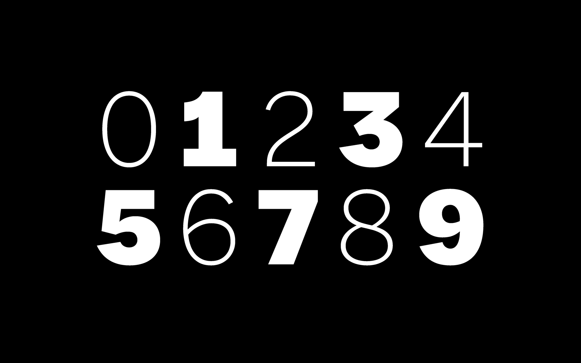
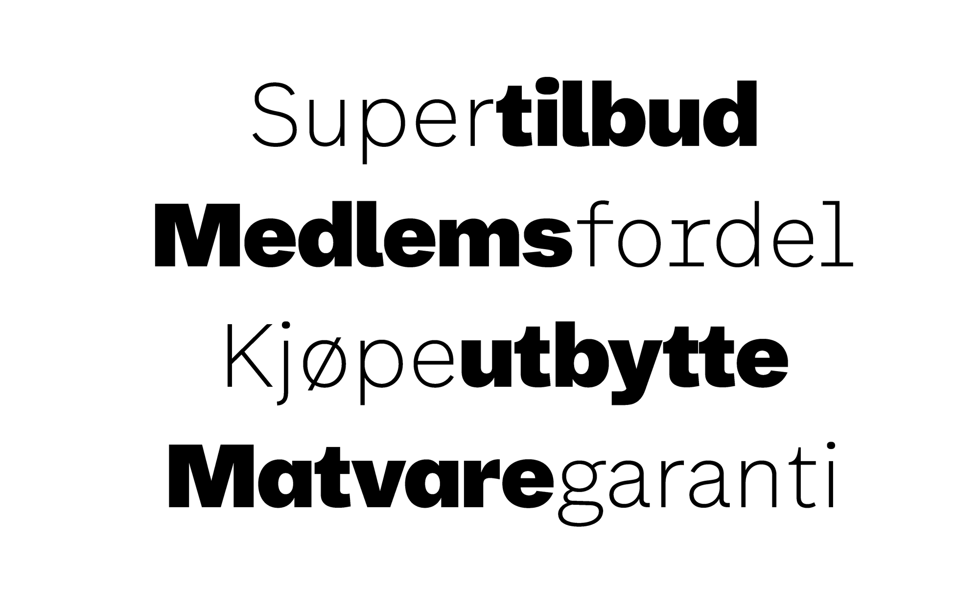
Coop Sans comes in 7 weights (plus respective italic styles) ranging from Thin to Black. Making use of Variable font technology extends the usability of Coop Sans into animation and web design and enables subtle typographic adjustments.
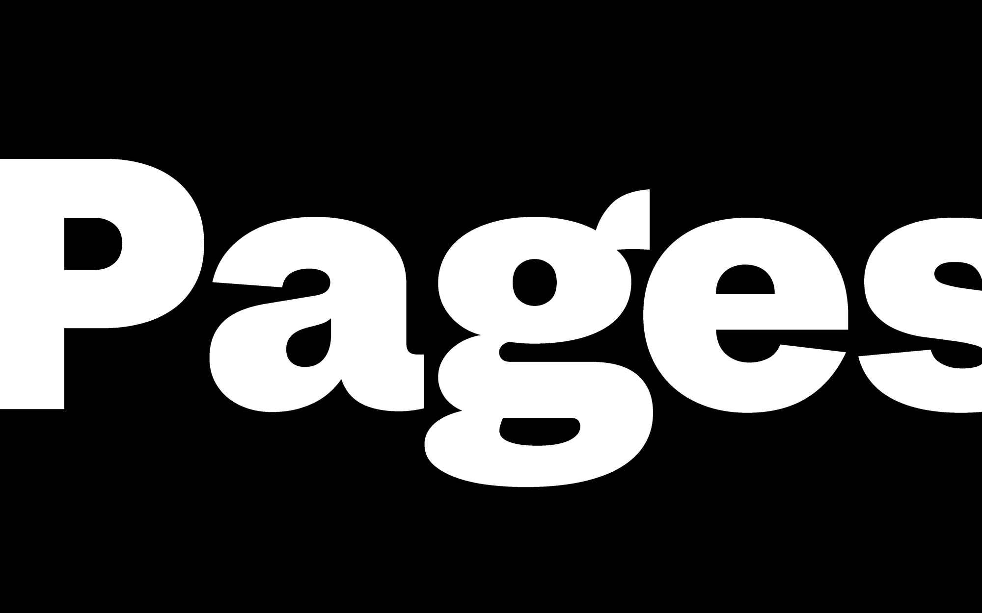

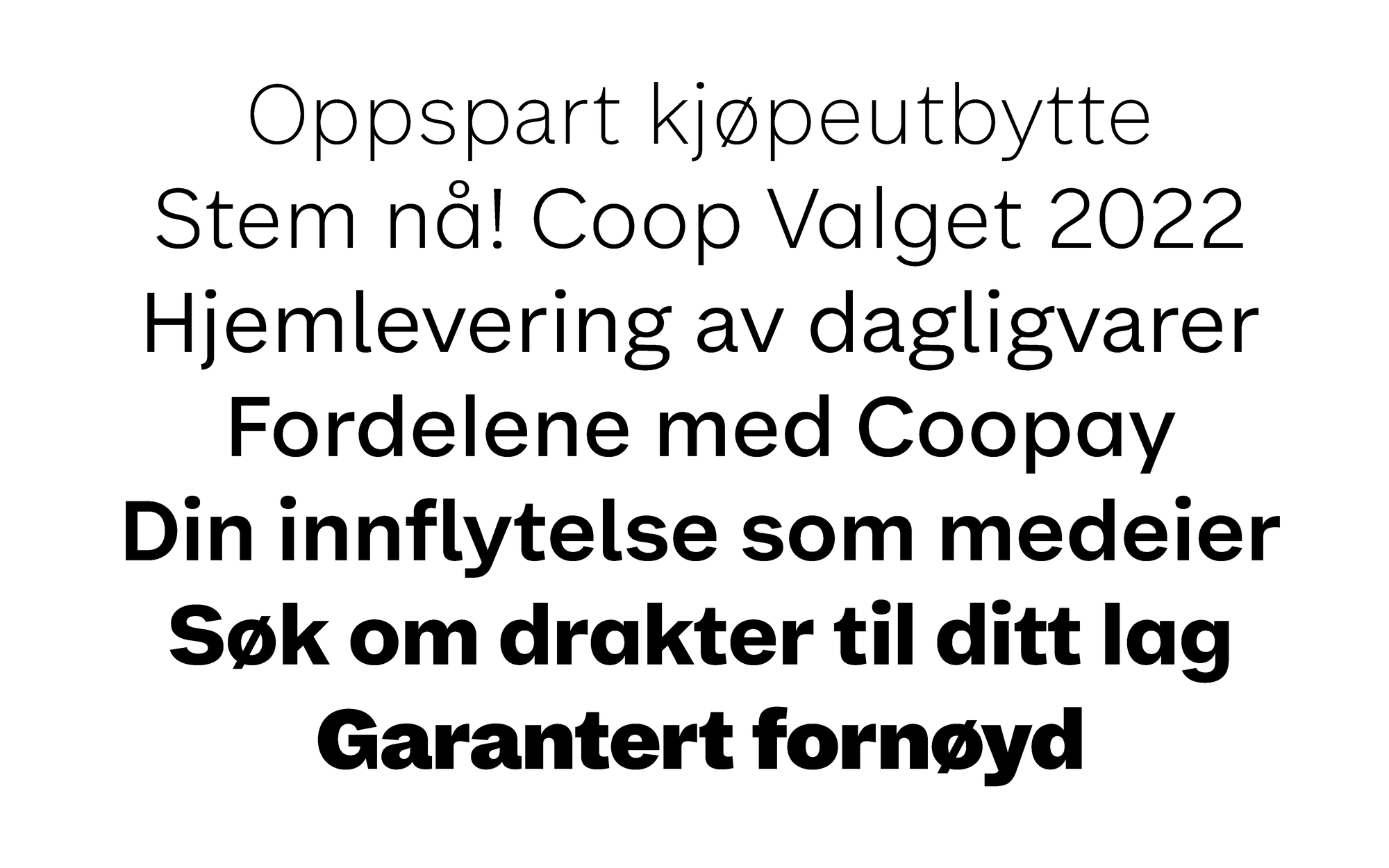
Besides the aesthetic considerations to give Coop Sans a legible and unique typographic voice, the concept of “delingsøkonomi” (sharing economy) acted as guiding principles for the development of this typeface family. Echoing the non-hierarchical nature of a commercial cooperative, the typeface family evokes an every-day quality and combines a rational with a social appeal.
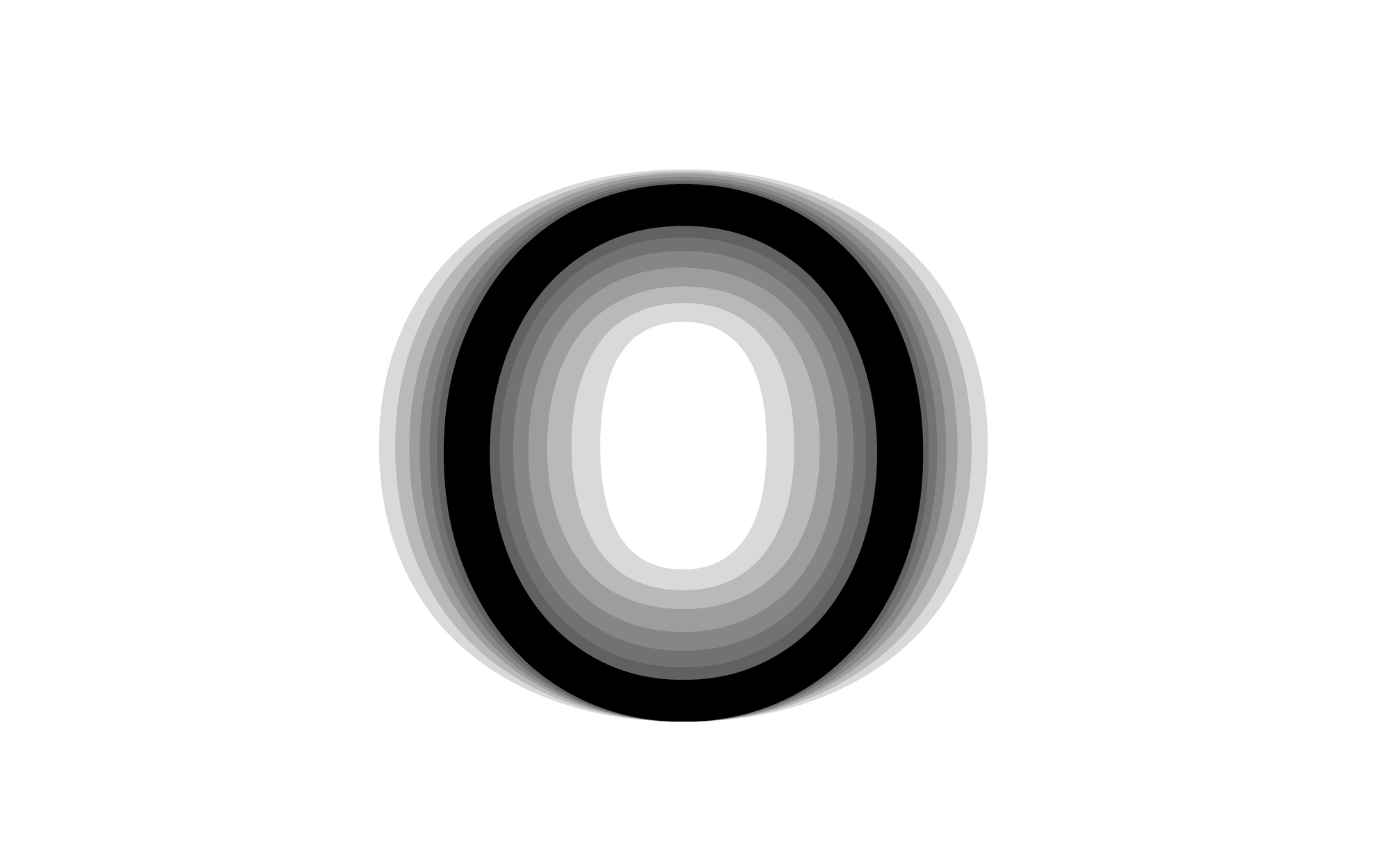

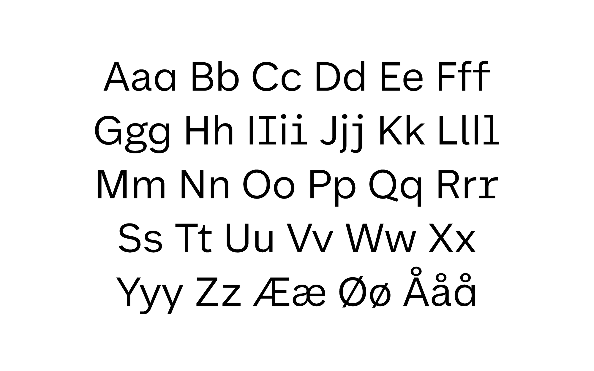
Coop Sans combines geometric with grotesk influences of both American and European origin. In order to express accessibility and simplicity the unobtrusive letter structure was combined with a subtle stroke contrast, open apertures and soft details.
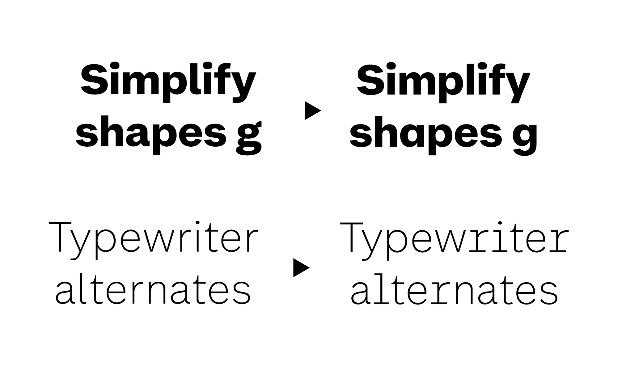
The implemented OpenType features (Simplified forms, Typewriter alternates) give further possibilities in varying the tone-of-voice within complex typographic hierarchies.

Prosjektleder: Hege Nalum-Utaker / ANTI Oslo
Art Direction: Erik Johan Worsoe Eriksen / ANTI Oslo
Font Mastering: Edgar Walthert
Accolades: Visuelt 2022 Gold