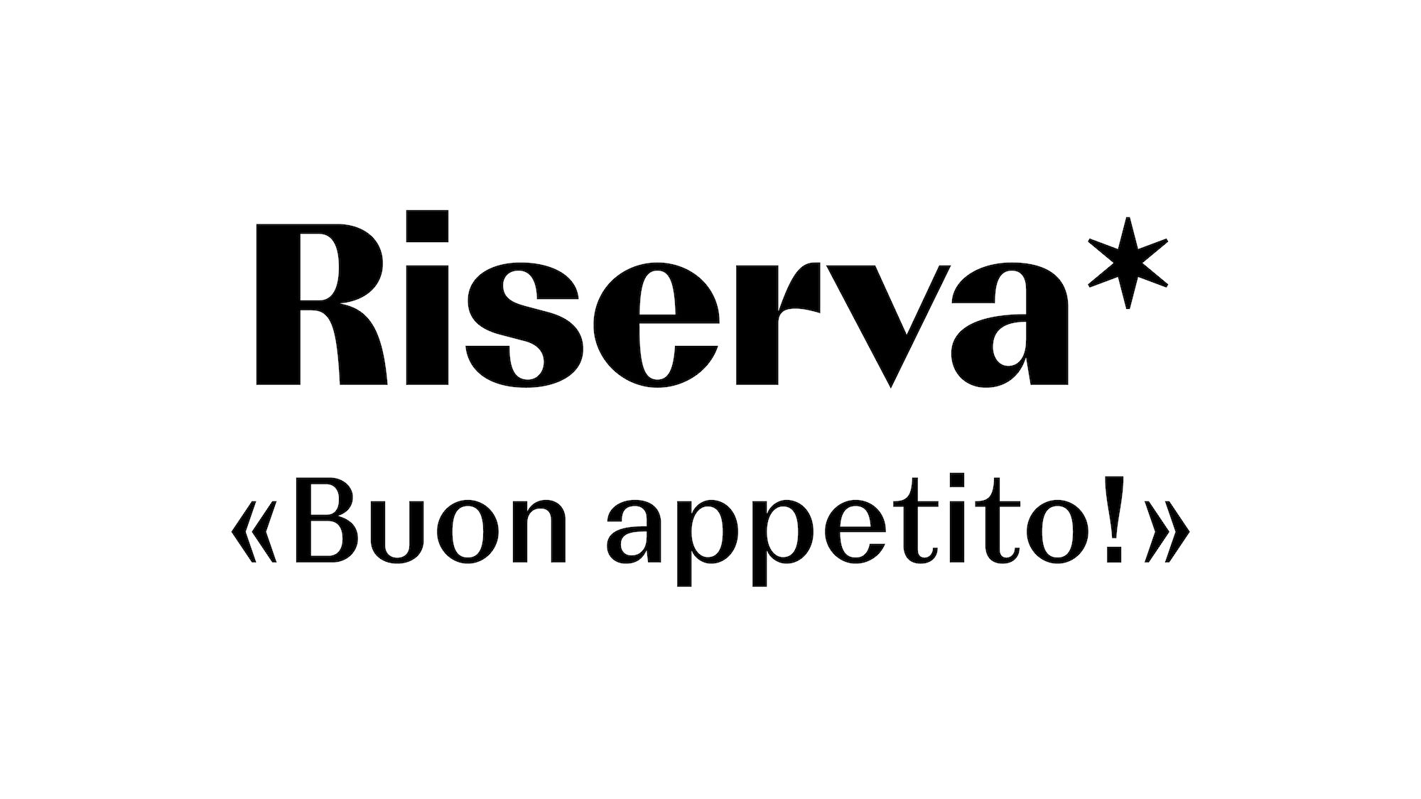
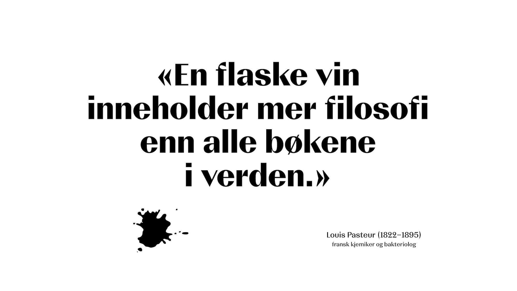
Custom Type, Logotype and Emblem for «Vinmonopolet»
Custom type in two styles developed in close collaboration with Dinamo as part of Vinmonopolet’s 2020 rebranding.
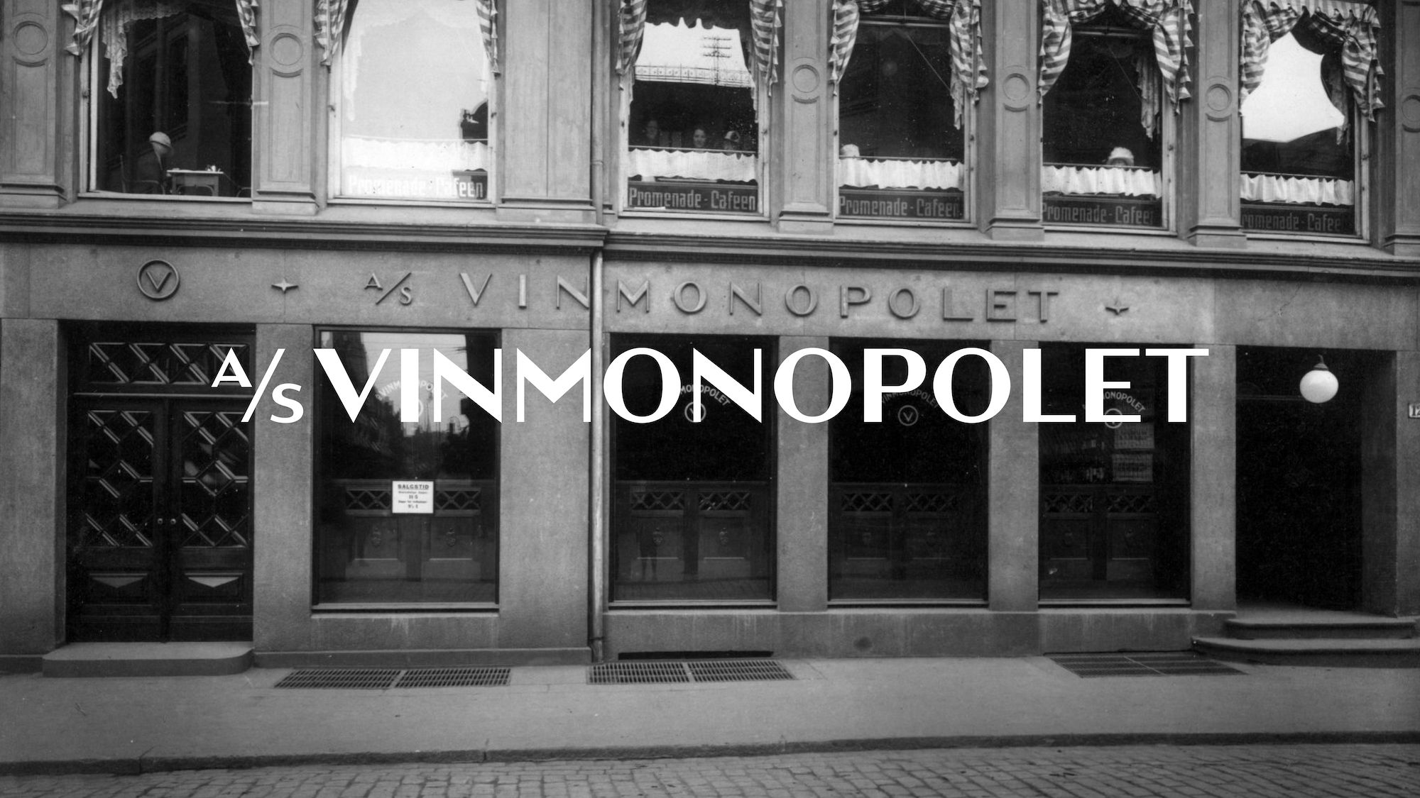
The typefaces are an extension of the newly drawn logotype based on historical signage used on Vinmonopolet façades up until ca. 1960. By doing so, the typefaces hark back on the heritage of Vinmonopolet and its importance within Norwegian society.
Visual clues, such as the amount of contrast and the fluidity of shapes, were also taken from Vinmonopolet’s symbol called «Polrosen», redrawn based on the original design by Hermann Bongard from 1956.
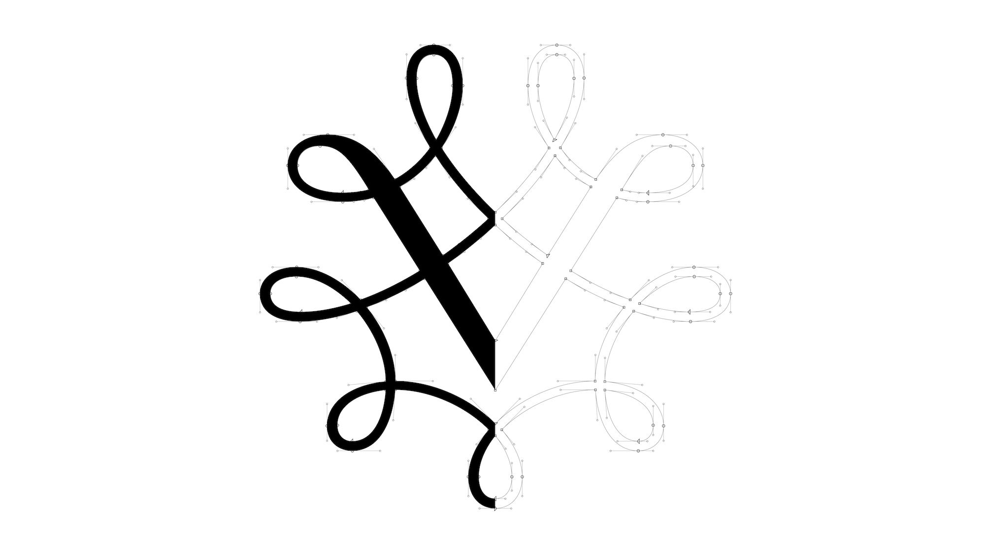
Image courtesy: Vinmonopolet AS
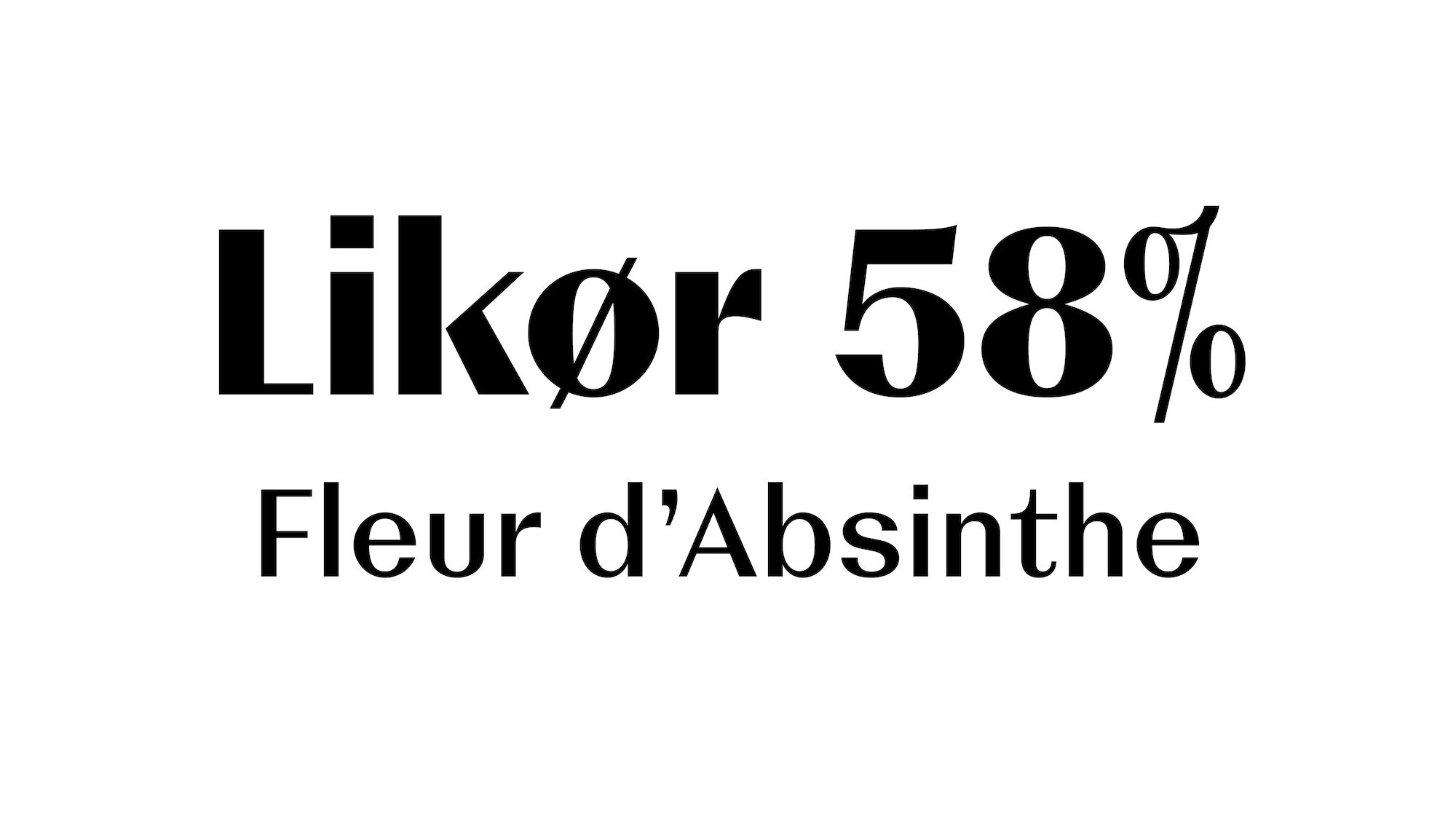
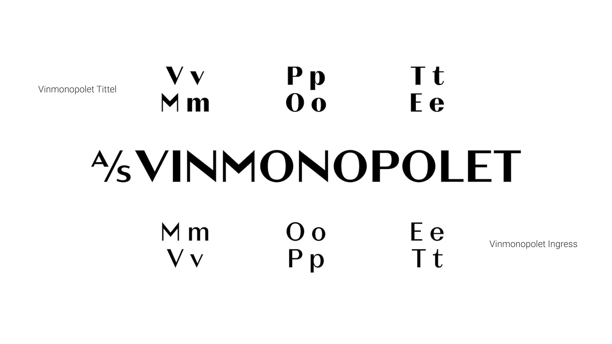
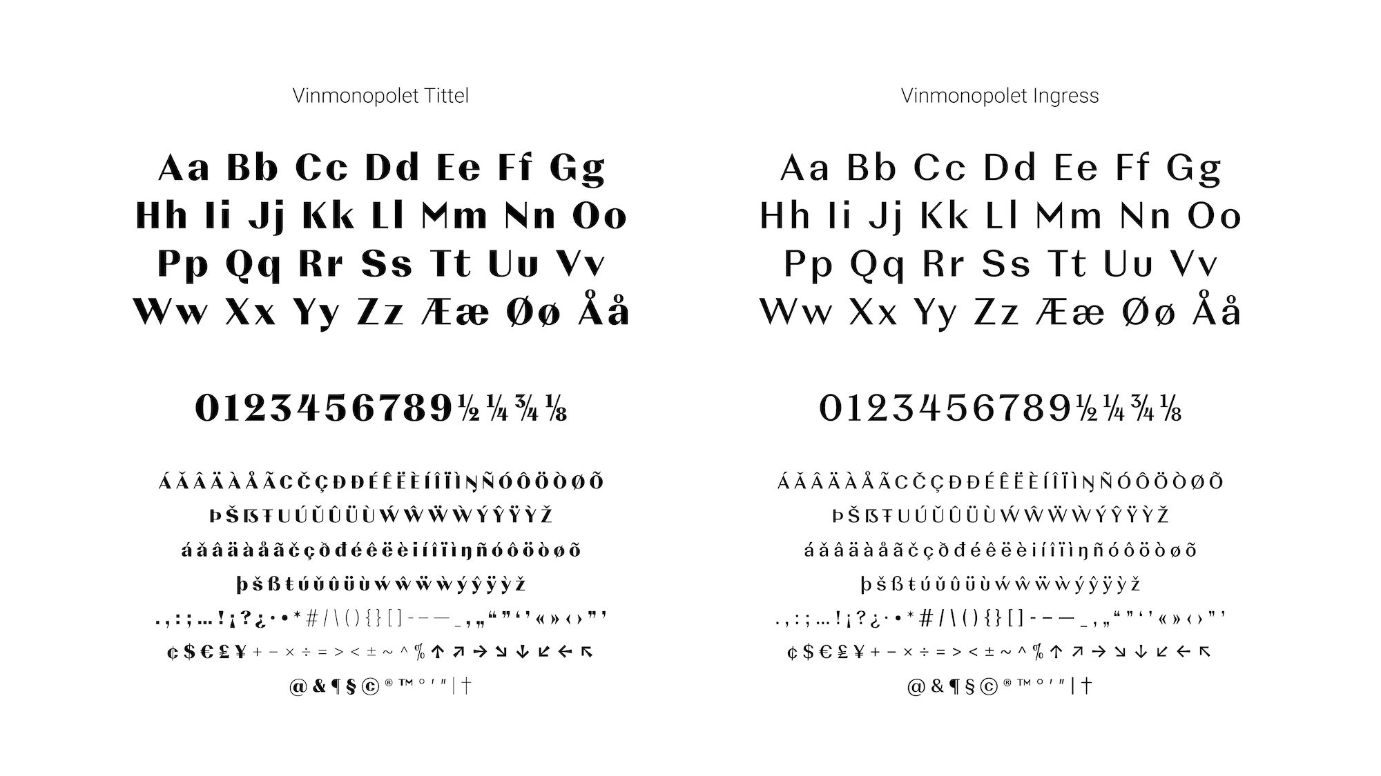
The Vinmonopolet typefaces belong to the elusive genre of “contrasted Grotesques”, combining the straightforwardness of sans-serif with the elegance and dignity of serif typefaces. In response to the core values of Vinmonopolet, the typefaces incorporate an emotional, inviting appeal yet with a notion of responsibility and rationality.
This is achieved by contrasting sharply drawn letter details, such as the perpendicularly cut terminals, with gracious ovals and soft transitions. Great attention has also been given to the curve tension and rhythmic structure of the typefaces resulting in an overall clean, controlled and sophisticated appearance.
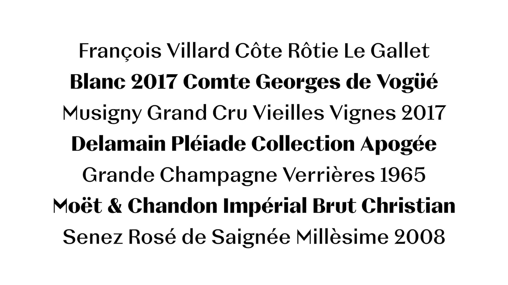

Image courtesy: Vinmonopolet AS
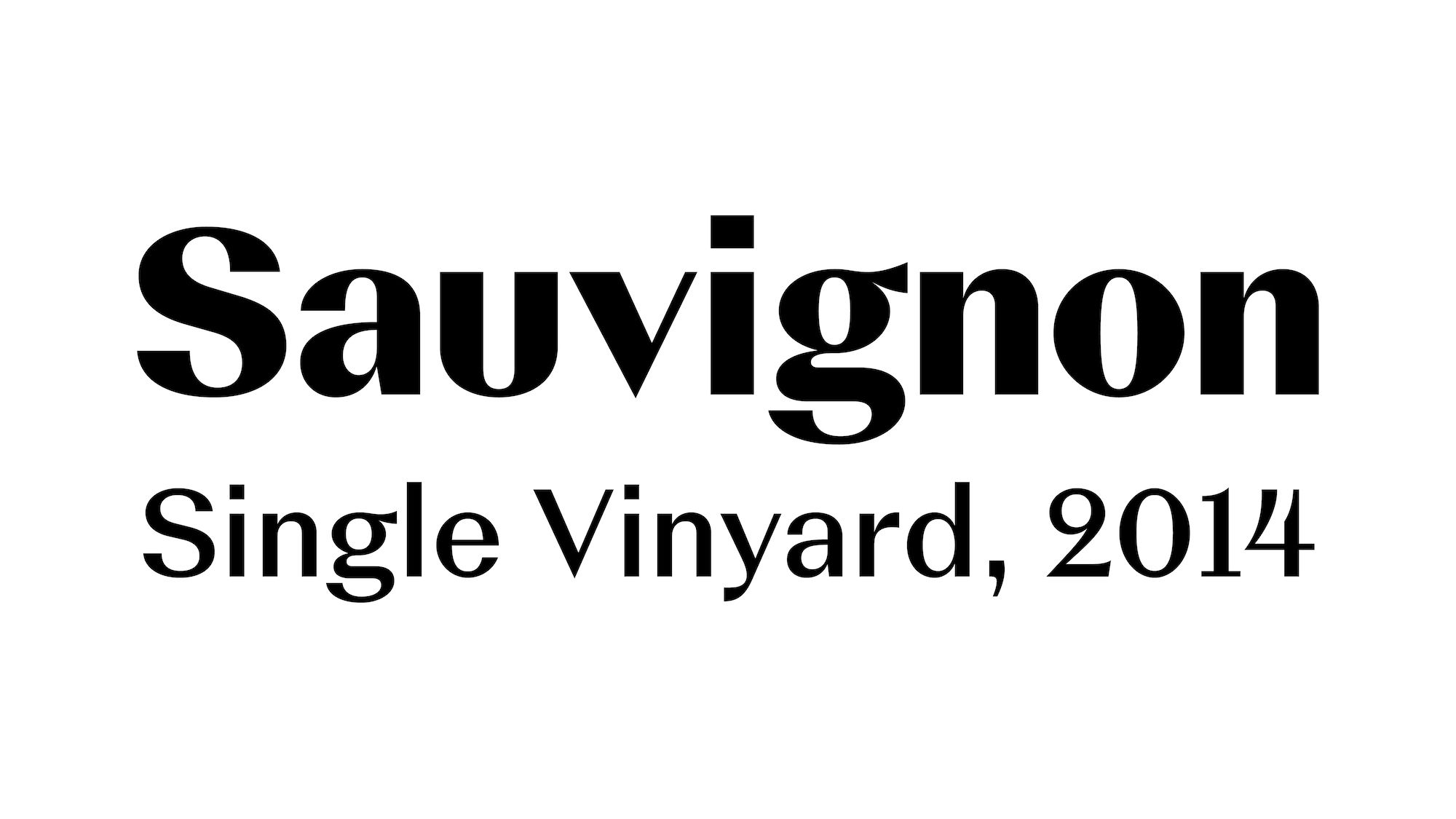
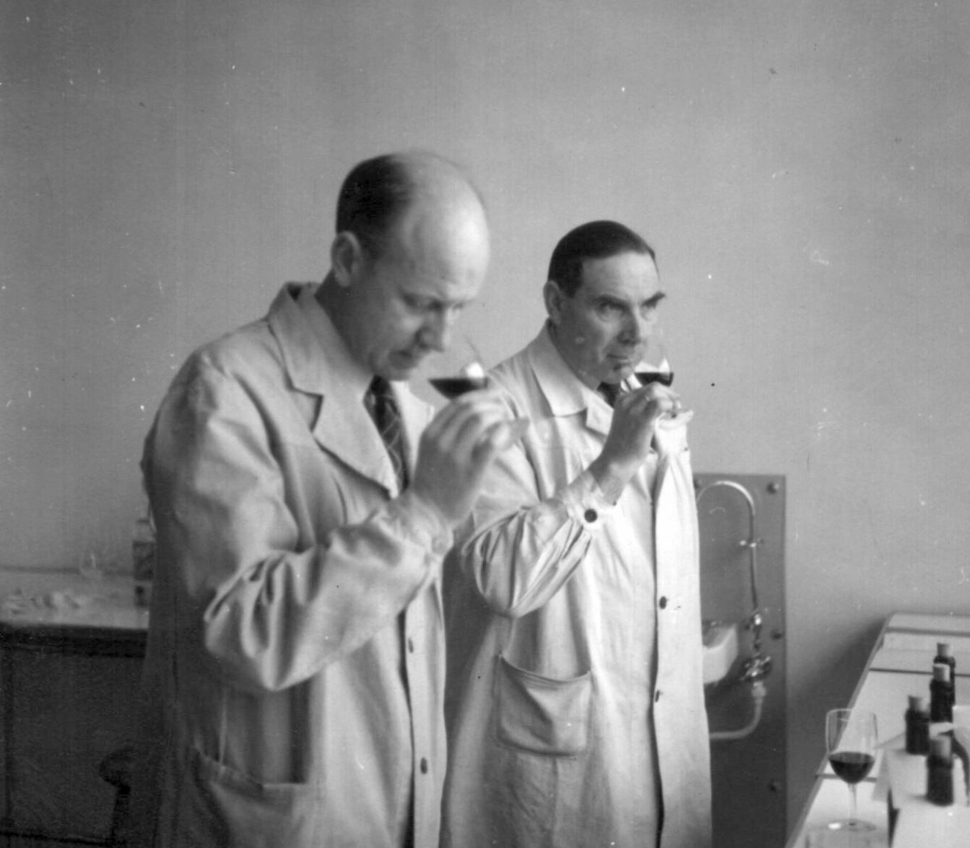
Image courtesy: Vinmonopolet AS
Mastering / TrueType Hinting: Edgar Walthert
Accolades: ED Award 2021 Bronze, Visuelt 2021 Diplom