


Information
Anders Hofgaard
Ellmer Stefan
1 style + Uppercase variants
2019
Anders Hofgaard
Ellmer Stefan
1 style + Uppercase variants
2019
Context
Gustav Vigeland (1869–1943) was one of Norway’s most well known (and controversially debated) artists of the first half of the 20th century. The monumental sculpture park envisioned by Vigeland as well as his former studio and residence now turned into a museum count amongst Oslo’s top tourist attraction.
For the occasion of his 150th anniversary in 2019, the Pyte Foundry designed a custom display typeface under the Art Direction of Anders Hofgaard from renown graphic design studio NODE Berlin Oslo.
Working closely with the museum curators gave access to an immense amount of archival material, including a set of glass negatives documenting the process and work of the Vigeland workshop.
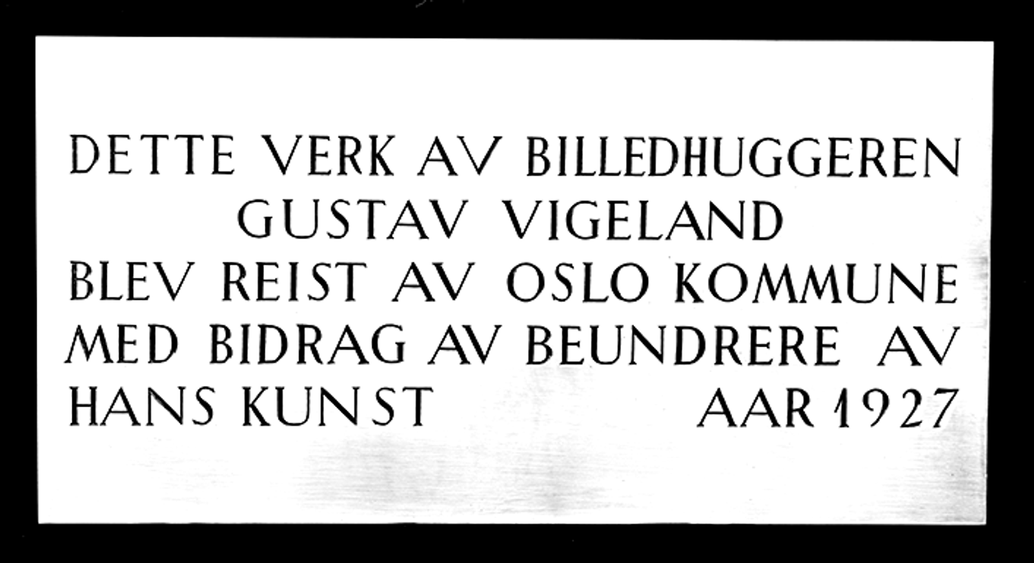
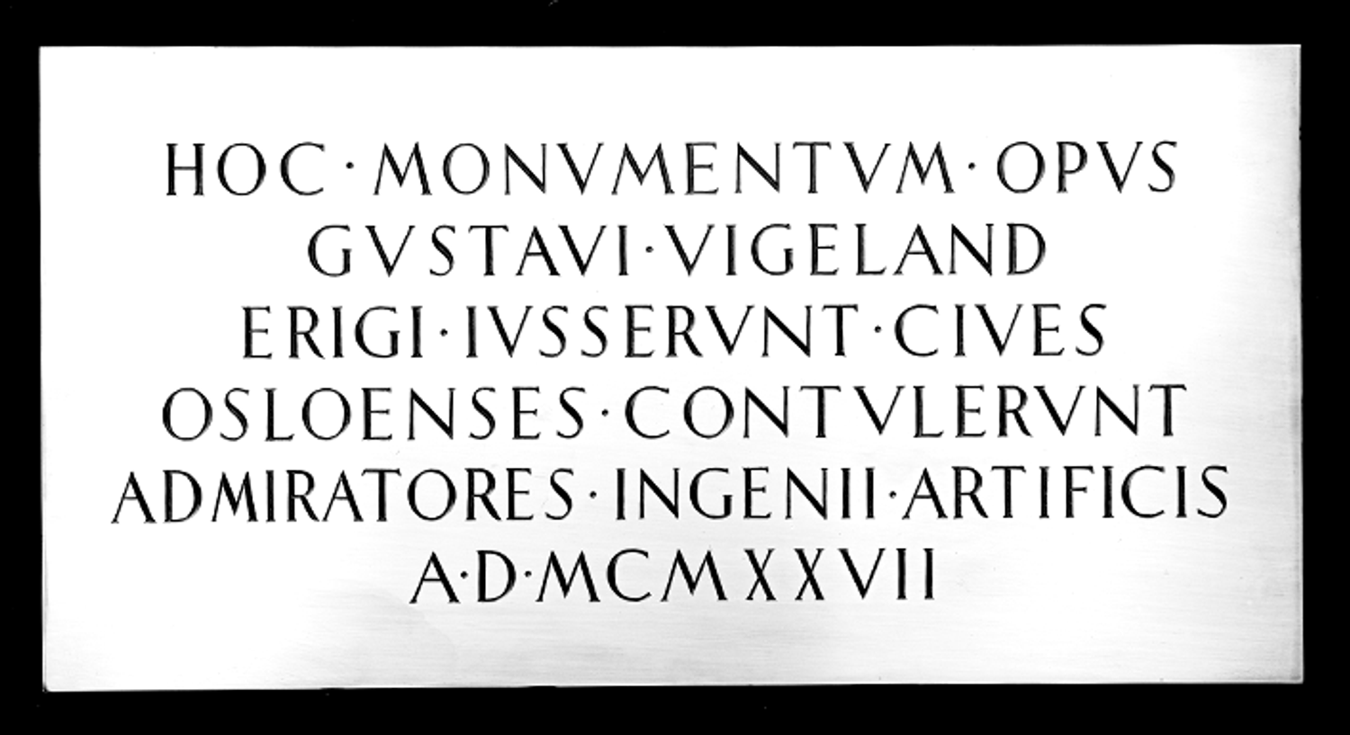
Sifting through the provided material, one image stood out and consecutively acted as a model for the development of the typeface. It depicts a two-sided metal plaque bearing inscriptions in Norwegian and Latin respectively. In 1927 this plaque was placed underneath the monolith situated atop the sculpture park and remains hidden from the public eye until this very day.
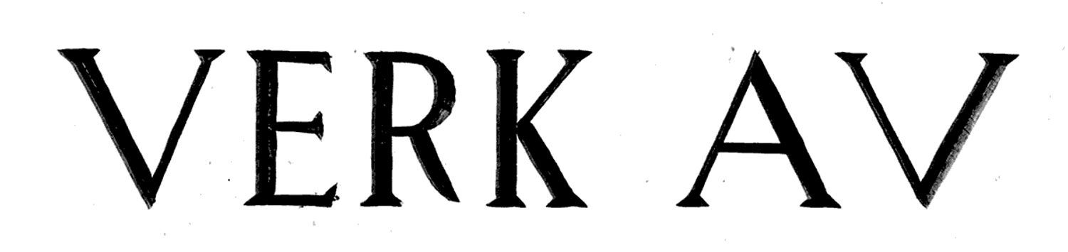
At first glance the inscriptions might appear homogeneous in its celebratory grace. Yet, on closer inspection there are several peculiarities to be observed. As if two stone carvers were responsible for either side of the plaque, the latin is more even and well executed compared to the Norwegian text. A quirky, rhythmical variation of spacious and narrow letters together with a wide array of weird details are on display here, culminating in the flipped letter V, a classic err amongst untrained lettering artists.
The typeface embraces the oddities of the original lettering without compromising on usability. Developed in two sets of capital letters it emulates the uneven rhythm resulting in distinct word images. The geometrically constructed, triangular serifs give it a graceful monumentality. To further enhance the inscriptional feel the typeface is equipped with historical idiosyncrasies, such as the use of V in place of U with the help of OpenType substitution.

The result remains a chiseled quality pairing raw brutality with sophisticated elegance, an unrefined structure colliding with polished detailing and tightly defined Bezier vectors.
In addition to the typeface, a versatile system of logotypes was defined. Together these elements form a strong, recognisable identity tying together all visual communication for the anniversary celebration of 2019.

The typefaces and logotypes were consecutively adapted and licensed for the general identity of Vigelandmuseet and paired with Oslo Sans, another custom typeface developed by the Pyte Foundry for the municipalities of Oslo.
