


Information
Rikke Hatlo, Anna Ducros
Ellmer Stefan
2 styles
2019/2020
Rikke Hatlo, Anna Ducros
Ellmer Stefan
2 styles
2019/2020
Context
Vinmonopolet («The Wine Monopoly») is Norway’s government-owned retailer for alcoholic beverage. Founded in 1922, its «primary goal […] is to responsibly perform the distribution of alcoholic goods while limiting the motive of private economic profit from the alcohol industry.»*
As part of Vinmonopolet’s identity redesign initiated in 2019, the Pyte Foundry developed a set of exclusive typefaces, a custom logotype and monogram in close collaboration with Oslo-based agency Dinamo Design.

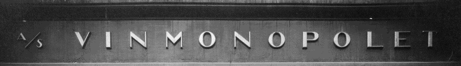
The two style type family as well as the logotype root in historical signage displayed on shop façades up until the 1960s. Harking back on its visual heritage, this emphasizes Vinmonopolet’s status and importance within Norwegian society.
Further visual clues were taken from Vinmonopolet’s swash monogram nicknamed «Polrosen». For the occasion, the monogram was redrawn with respect to the original design by Hermann Bongard from 1956.

The Vinmonopolet typefaces belong of the elusive genre of contrasted Grotesques, combining the straightforwardness of the sans-serif with the elegance and dignity primarily associated with serif typefaces.
In response to the core values of Vinmonopolet, the typefaces incorporate an emotional, inviting appeal yet with a notion of responsibility and rationality. This is achieved by contrasting sharply drawn letter details — such as the perpendicularly cut terminals — with gracious ovals and soft transitions. Great attention was given to the curve tension and rhythmic structure of the typefaces resulting in an overall clean, controlled and sophisticated appearance.


The custom typefaces take on a leading role in the newly envisioned identity, both aesthetically and functionally. They act as a highly recognisable element in online and offline media as well as signage and in-store wayfinding. By merging graphic expression with typographic qualities of clarity and readability these typefaces meet the demands of universal design and brand recognition alike.
For a complete case and real-life imagery visit Dinamo Design’s website and vinmonopolet.no.
