The Pyte Foundry Acrylic Anamorphe Compagnie Kinckq Manoeuvre Pyte Legacy Triptych Shandy Bibeltype Coop Norge Diller, Scofidio + Renfro Hamran Henie Onstad Kunstsenter Logotypes Skald Sperling Ultima Vigelandmuseet Vinmonopolet Information Shandy Specimen Technical Context In use Buy/try The Pyte Foundry Acrylic Anamorphe Compagnie Kinckq Manoeuvre Pyte Legacy Triptych Shandy Bibeltype Coop Norge Diller, Scofidio + Renfro Hamran Henie Onstad Kunstsenter Logotypes Skald Sperling Ultima Vigelandmuseet Vinmonopolet Information Shandy Buy/try

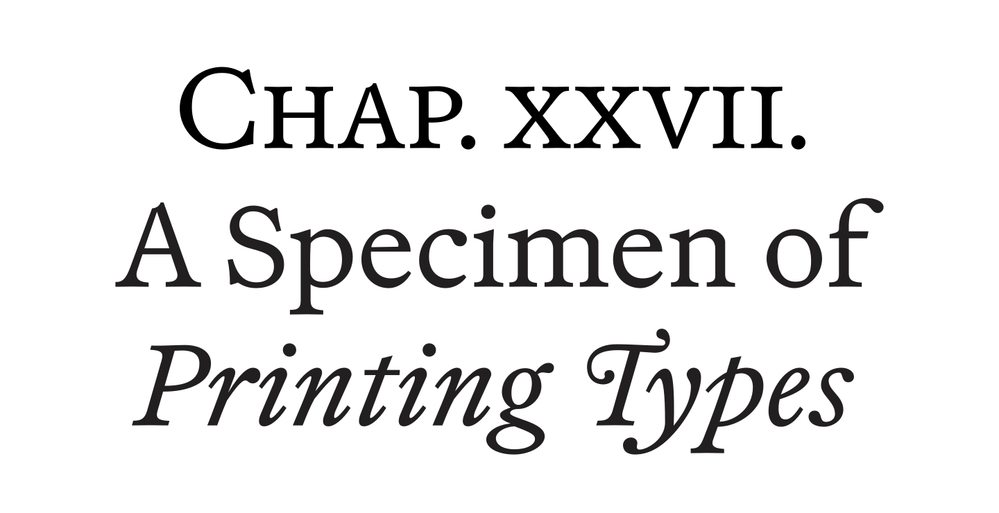
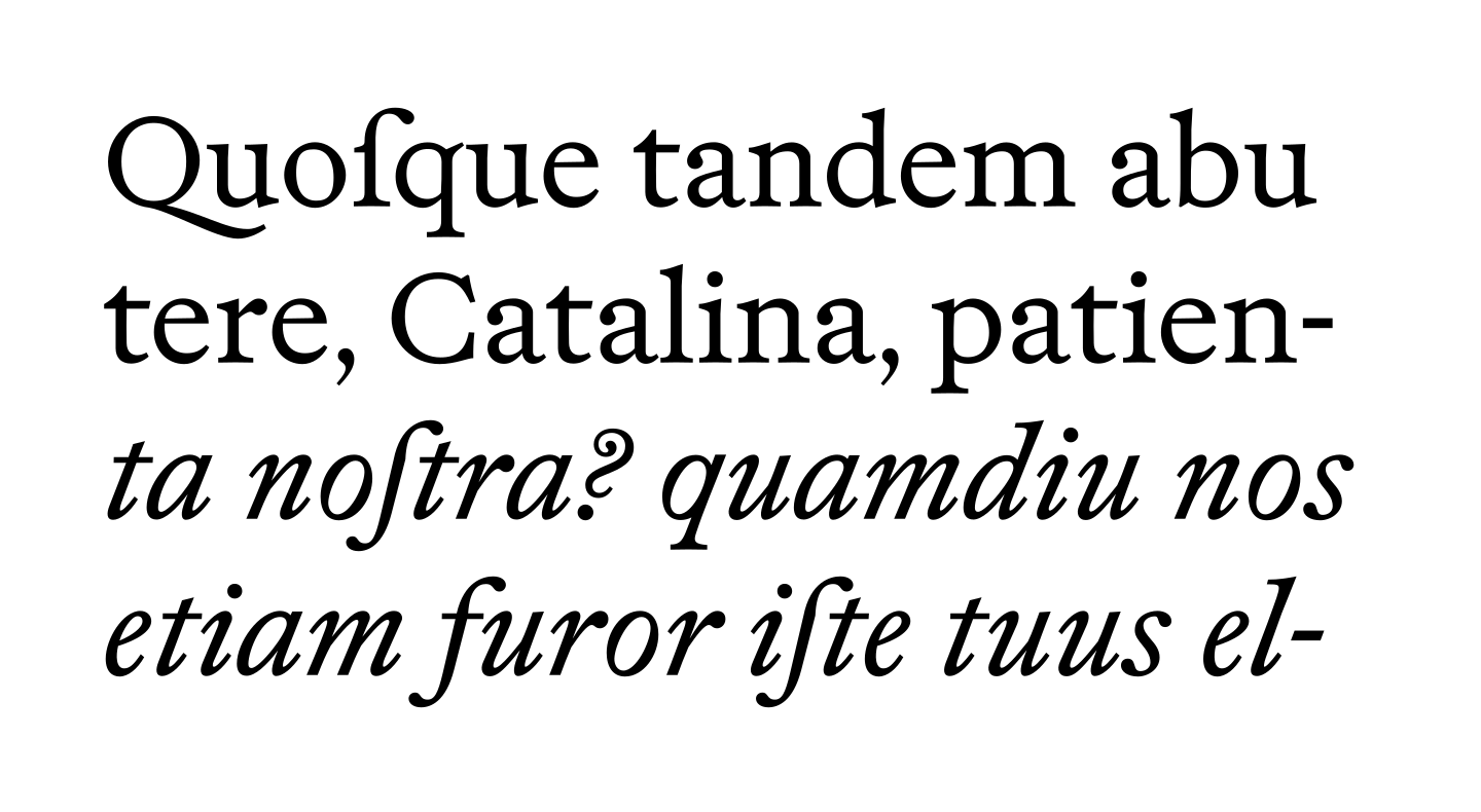
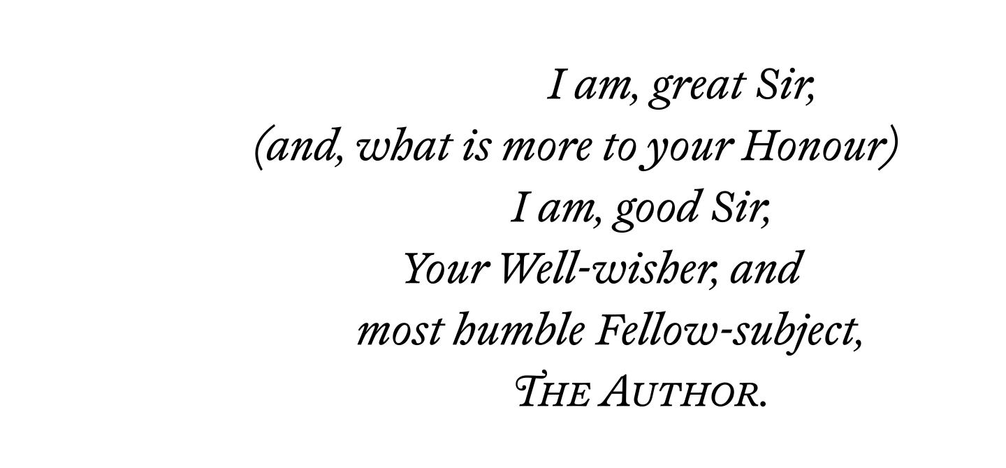
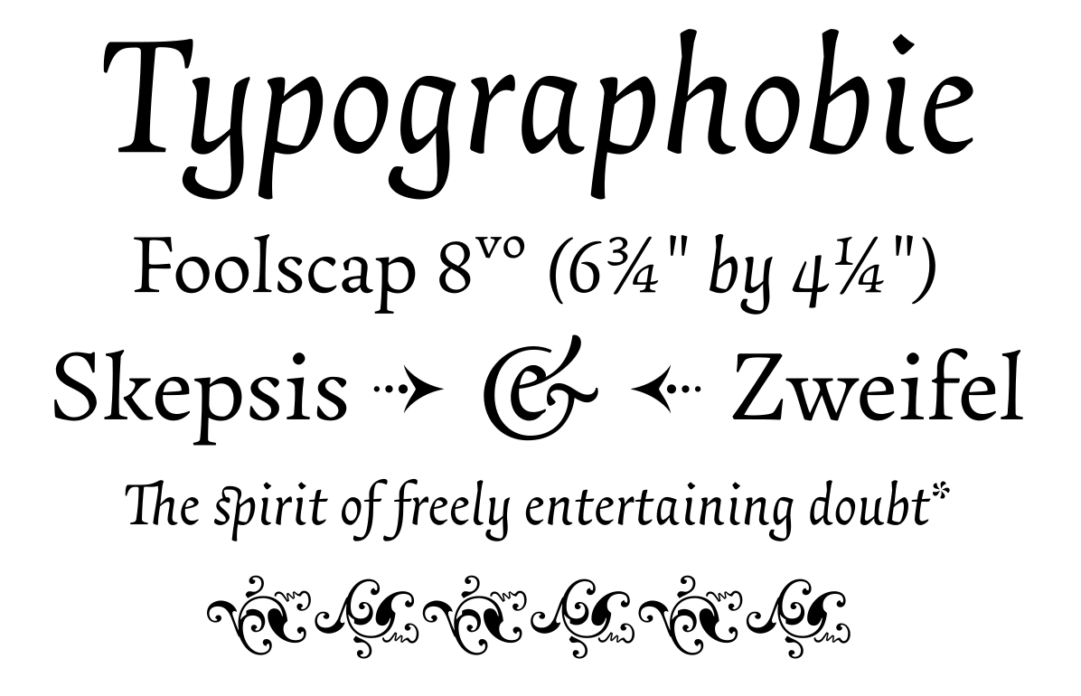
Shandy is a compendium of sturdy book faces inspired by the iconic English Old styles of the early 18th century as well as a tribute to the quizzical writing of Laurence Sterne, best exemplified in his novel “The Life and Opinions of Tristram Shandy, Gentleman”.

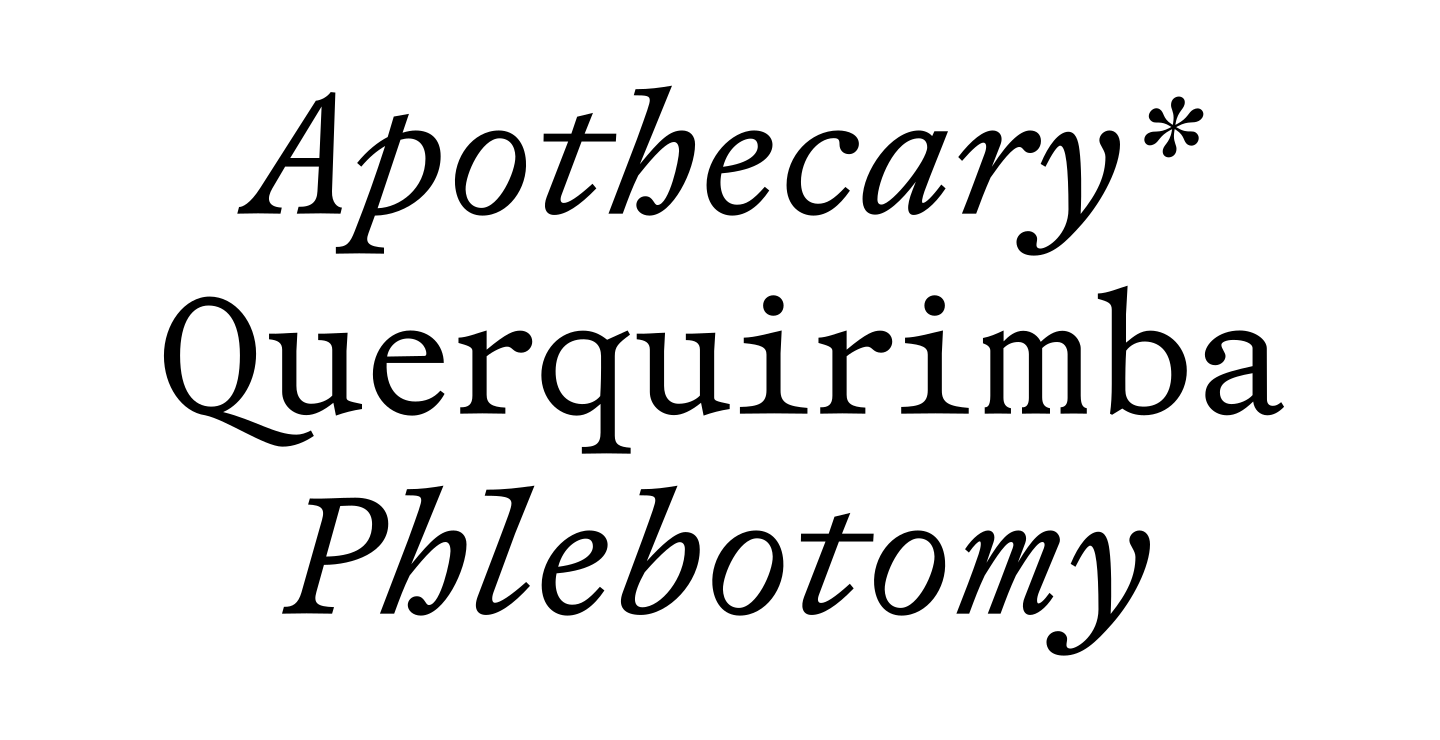
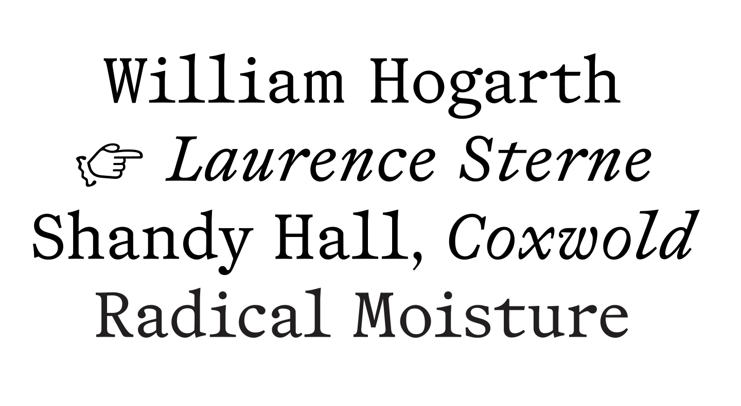
Shandy comes in 3 sub-families; from proportional (Omni) via a hybrid weirdo (Poly) to a pure fixed-width (Mono) variant, all with their respective Italick [sic!] styles. Not more, not less.

Specimen

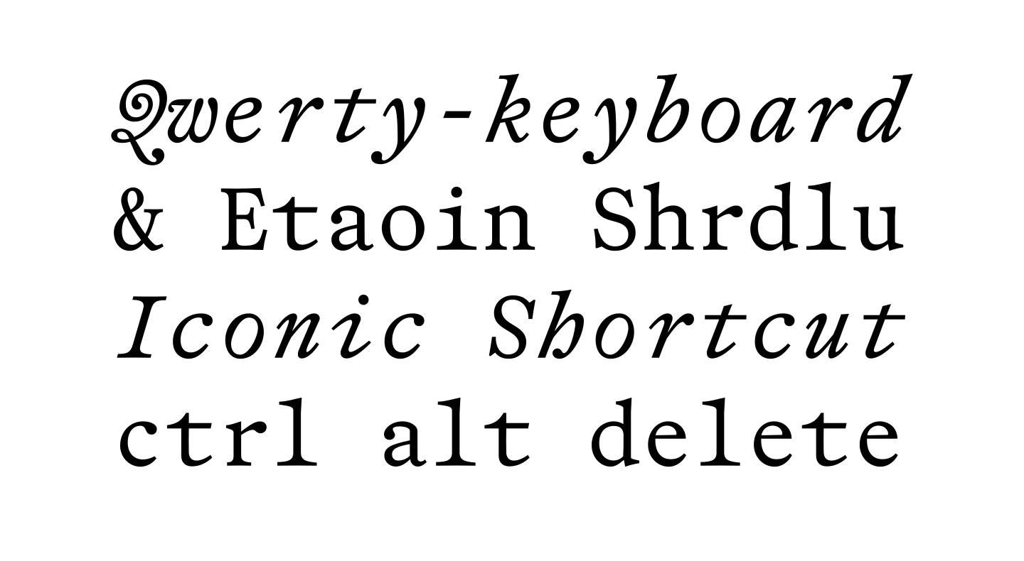
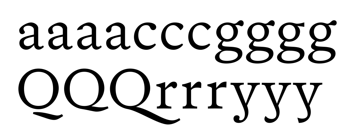
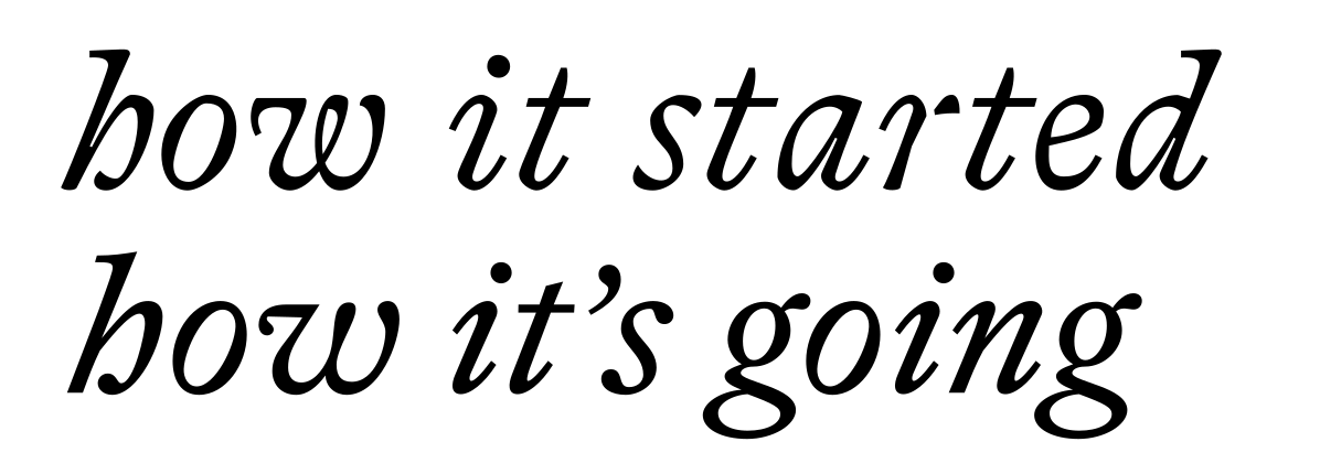
Shandy Omni Italick (+ swsh) | Book
Shandy Omni Book | Italick
Shandy Omni Book (+ smcp) | Italick (+ swsh)
Shandy Omni Book (+ swsh) | Italick
Shandy Omni Italick (+ swsh, + smcp)
Shandy Omni Book (+ ss01) | Italick (+ ss01)
Shandy Poly Italick
Shandy Poly Italick | Book
Shandy Poly Italick | Book (+ swsh)
Shandy Poly Book | Italick
Shandy Poly Book (+ smcp) | Italick
Shandy Poly Book
Shandy Poly Book | Italick + Triptych Grotesque
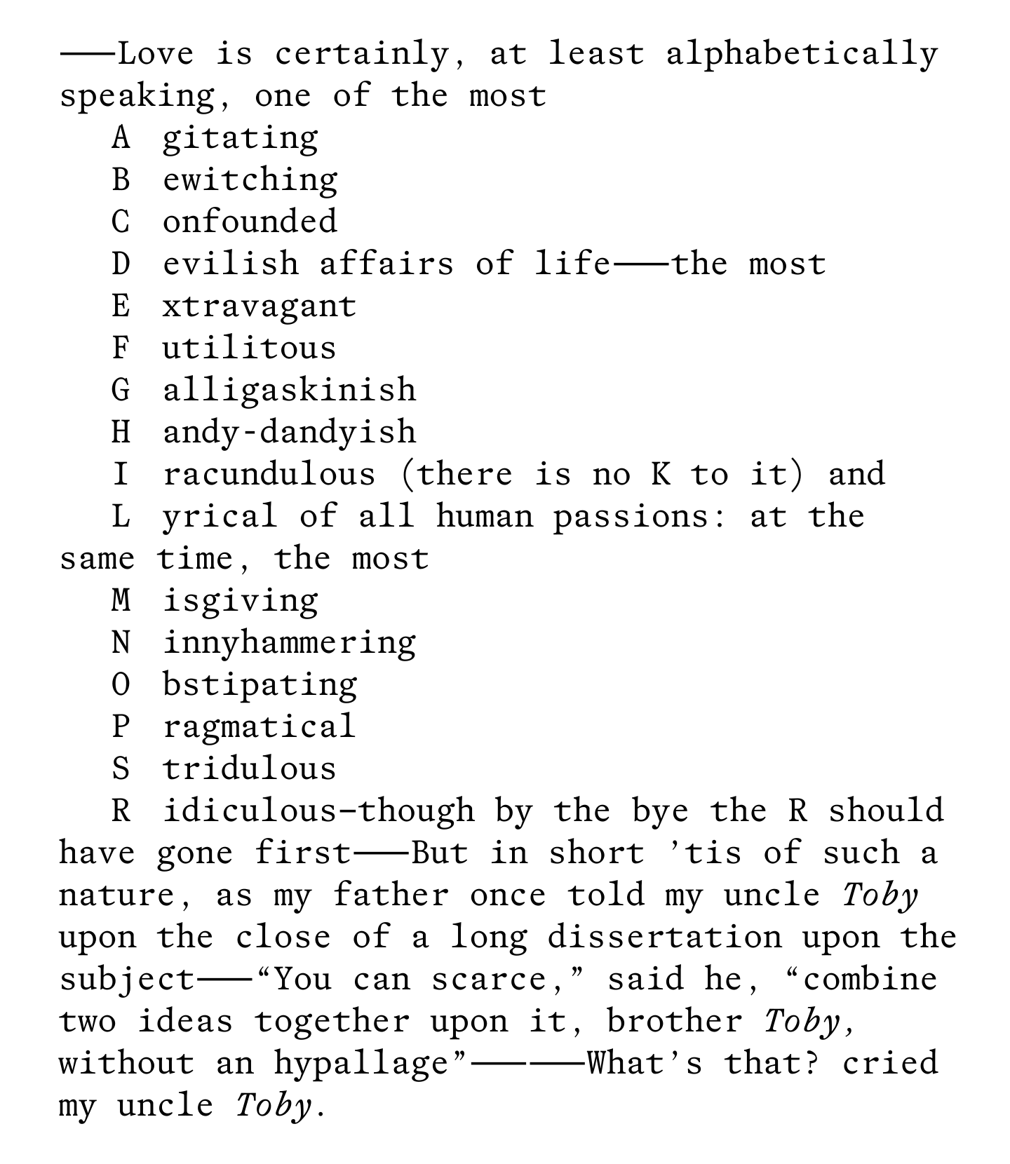
Shandy Mono Book
Shandy Mono Italick | Book (+ smcp)
Shandy Mono Book | Italick
Shandy Mono Italick (+ swsh, + ss01) | Book
Shandy Mono Book | Italick
Shandy Mono Book
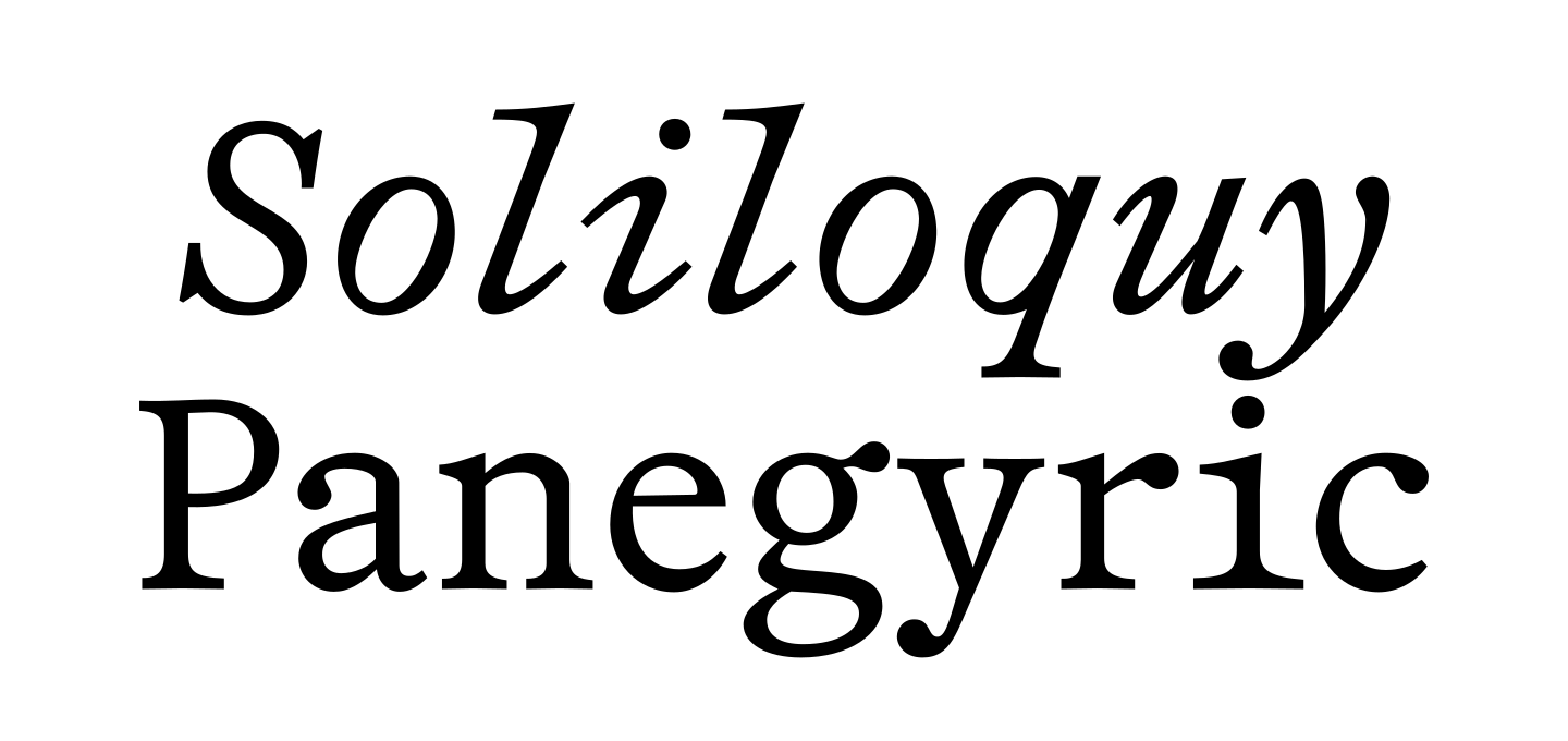
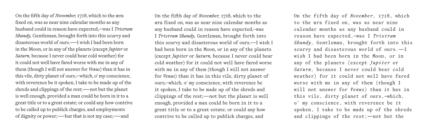
Shandy Omni | Shandy Poly | Shandy Mono

Technical information

Designer Mastering

Anselm Felter

Add. Metrics Families

Shandy Omni (2 styles) Shandy Poly (2 styles) Shandy Mono (2 styles)

Formats

OTF (cubic) WOFF2 (cubic)

Released

August 2026

Version

1.0 (20260813)

Specimen
Designer
Mastering

Anselm Felter

Add. Metrics
Families

Shandy Omni (2 styles) Shandy Poly (2 styles) Shandy Mono (2 styles)

Formats

OTF (cubic) WOFF2 (cubic)

Released

August 2026

Version

1.0 (20260813)

Specimen

Opentype features

Standard Ligatures (liga) — Omni only!
offline office
Discretionary Ligatures (dlig) — Omni only!
octo east
Contextual Alternates (calt)
——————
Case-Sensitive Forms (case)
(A–B]
Small Capitals (smcp)
Smcp FTW
Small Capitals from Capitals (c2sc)
Smcp FTW
Proportional Oldstyle Figures (default)
19. 08. 1982
Tabular Oldstyle Figures (tosf, tnum)
12+3≠45
Proportional Lining Figures (pnum, lnum)
2019
Slashed Zero (zero)
£ 100
Superscript (sups)
E=mc2
Subscript (subs, sinf)
C24
Prebuilt Fractions (frac)
1/2 3/4
Prebuilt Fractions (frac)
21/45
Ordinals (ordn)
1a 2o
Flipped S and s (ss01)
Sisyphos
Centered Asterisk (ss16)
F*ck it!
Smart Stuff (ss17)
(c) tel. !?
Practical Subs (ss18)
12 x 3 m “
Smart Arrows (ss19)
<- here ->
Long s (ss20) + Contextual Alternates (calt)
substitutes

Context

In 2007 C.E. — during my studies in graphic design at the University of Applied Arts Vienna — I was wise enough to angle for input outside the design department and fortunate enough to witness the eye-opening and mind-blowing lectures of Austrian poet, writer and essayist Ferdinand Schmatz. His flabbergasting sermons elegantly tied together literature, fine art, philosophy and history, covering vast territory between text and image, body and language, sense and non-sense.

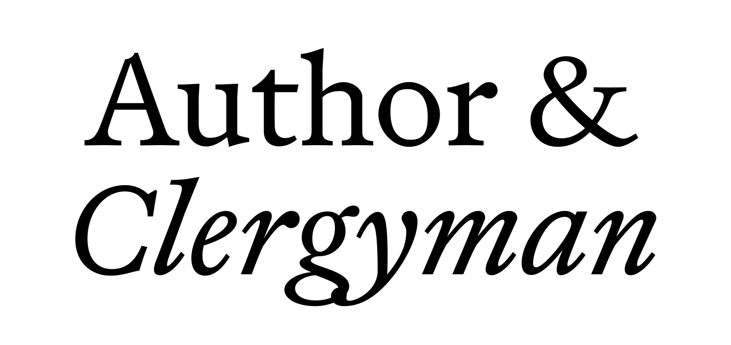
It was through Mr Schmatz and a joint visit to the exhibition “Shandyism” at Secession Vienna that I was introduced to an outmost quirky novel written between 1760 and 1769 by the English writer, humourist, sentimentalist & clergyman Laurence Sterne.

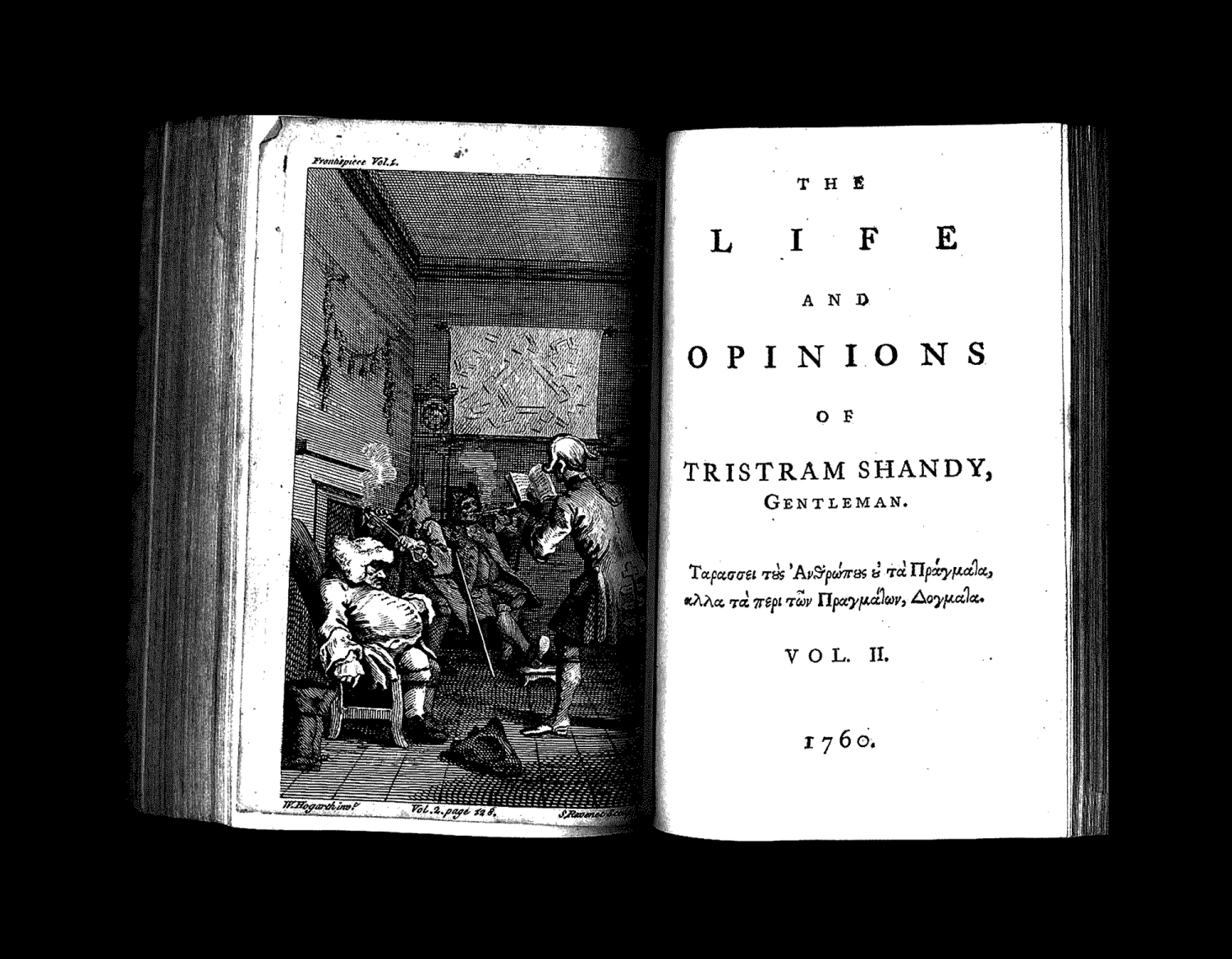
First edition title page with frontispiece by William Hogarth, 1760.

“The Life and Opinions of Tristram Shandy, Gentleman” is an outlier of English literature of the Georgian period — not that I would know anything about that —, “a post-modern novel before there was anything modern to be post about”. These books — in the plural, as they were initially published as a series of nine separate volumes — are a marvellous treasure trove of literary, visual and typographic devices.

An ever so hesitant narrator attempts to tell the story of the main protagonist Tristram Shandy, interspersed with comical manoeuvres of “learned wit” and tedious tangents on noses, hobby-horses and the art of fortification.

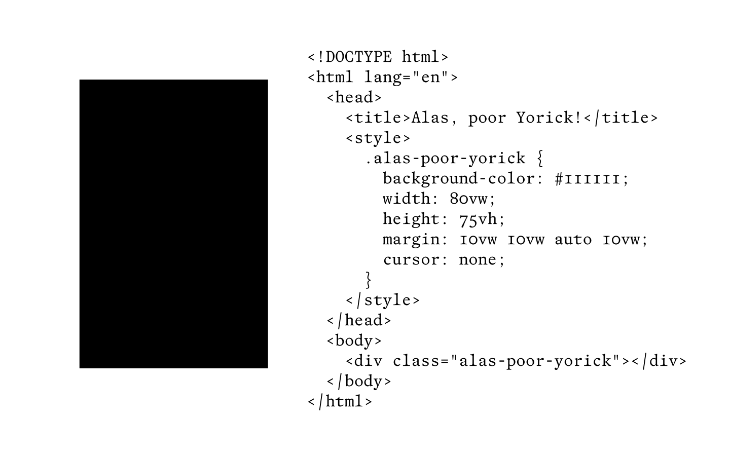
In Volume I, a black page indicates the death of the village clergyman — Alas, poor Yorick! — whilst in Volume VI a blank page is provided for the reader to draw a portrait of the concupiscible widow Wadman. A marbled page inserted in Volume III — the “motly emblem” of the narrator’s (and by extension, the author’s) work — would make every copy of the book into a unique object.

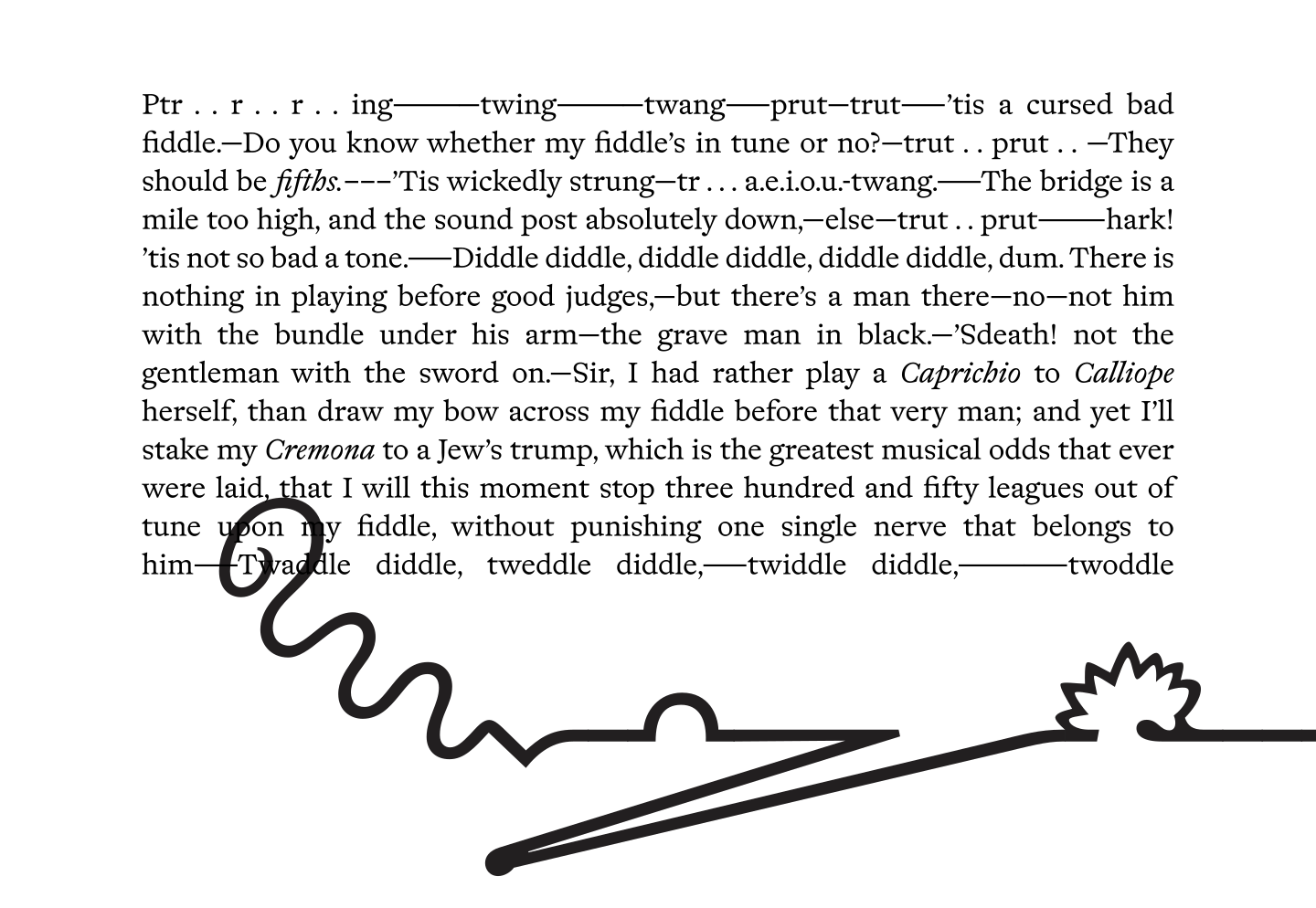
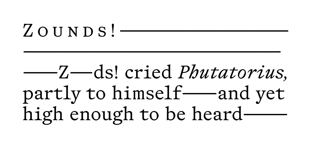
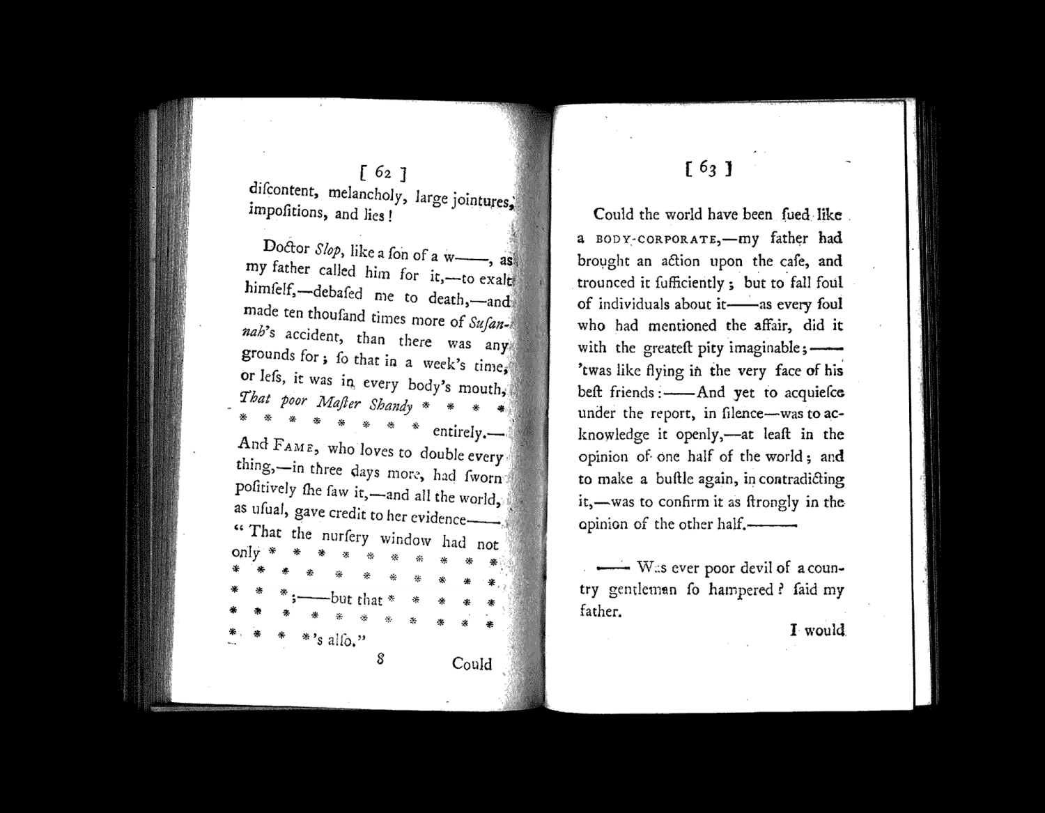
Throughout the novel, a series of eccentric typographic artifices are employed; omitted text passages are replaced by asterisks, dashes of all lengths are fragmenting the narrative flow with digressive thoughts and interjections, a series of onomatopoeic transcriptions are highlighting the failure of descriptive language.

These unconventional features — and there are a many more not mentioned here — made Tristram Shandy a conceptual ready-made that begged to be typographically embraced, or otherwise honoured.


In 2014 C.E. — still a greenhorn-wannabe type designer — I released my first typeface Essay Text with TypeTogether. My pretentious aim was to combine the spirit of Renaissance type with the essayistic writing and philosophy of Michel de Montaigne (1533–1592). With infinite ambition — paired with very finite ability — I attempted to contextualize Essay not only within typographic history but also within a wider field of ideas and culture that would reflect my own aspirational, autodidact Qve scay-ie. Simultaneously I was enviously eyeballing with other literary tribute typefaces, such as Inigo Jerez homage to Don Quixote or Alejandro Lo Celso’s flirting with Jorge Luis Borges.

Essay Text as drawn by a “youthful” Me and released through TypeTogether in 2014.

First sketches for Shandy — the typefaces that I desperately try to promote with the text you are reading — were drawn around the time of Essay’s release. In the same ethos I strived for a twofold rendition. On one hand — the left — the types should pay tribute to the quizzical, wondrous writing found in Tristram Shandy; on the other hand — dextra manus — the iconic English Old style of the late 17th and early 18th century should serve as a guiding light in the design process.

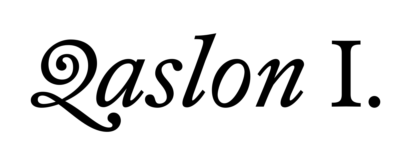
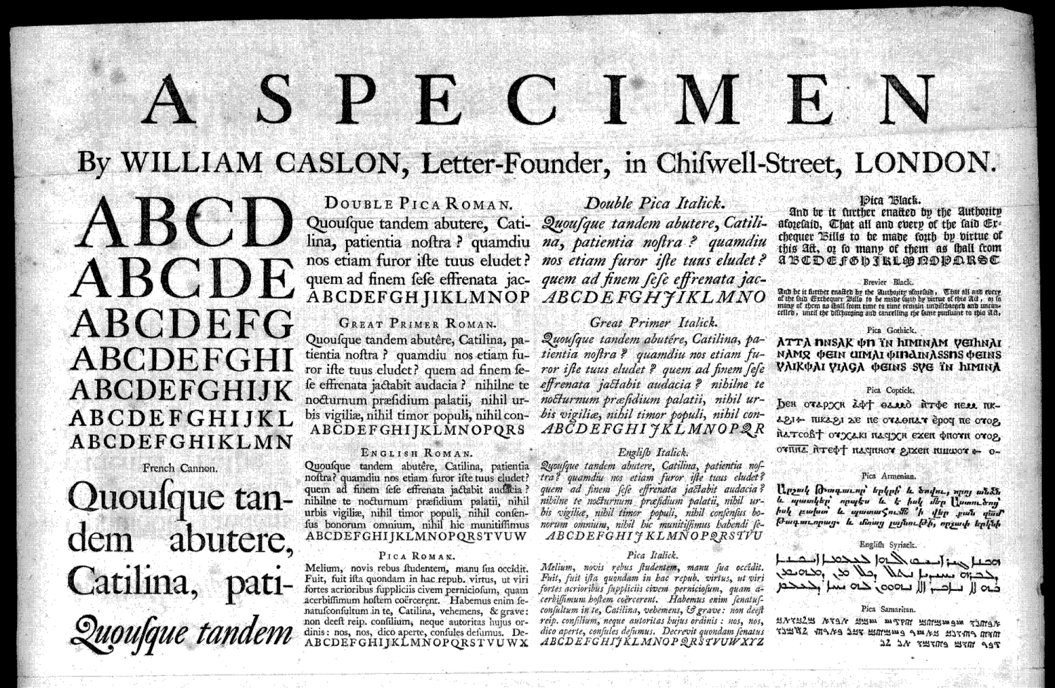
Here I will ask you, dear Reader, to imagine a well researched paragraph elegantly redrawing the lineage from the Dutch styles imported to the British Islands in the 1600s — namedropping John Fell, the Bishop of Oxford, and the esteemed punchcutters Peter de Walpergen, Dirck Voskens and Christoffel van Dijck — to the emancipation and establishing of a true English idiom by William Caslon I. in the early 1700s, just before John Baskerville would stir up the aesthetic game with his pointed-pen-informed, oh-so-refined Transitional interventions.

Specimen sheet by William Caslon I., 1734.

After a long phase of initial fumbling — I could show a myriad of versions, attempts, failures, sketches, near-misses and dead ends — the project later baptized Shandy was lying dormant for years. Every once in a while I would revisit the working files just to induce more confusion, drawing some indecisive variants, weights and optical sizes, randomly adding and removing features and flavours.

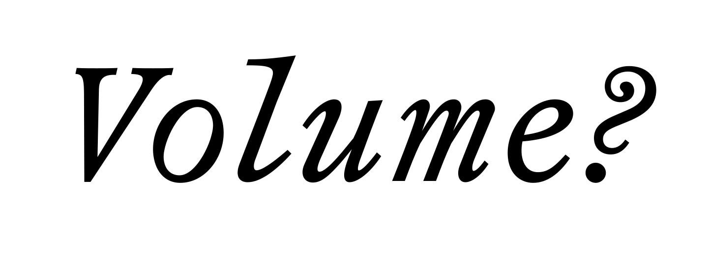
In 2021 C.E. I was approached by my fellow die-Angewandte alumni, friend and designer Astrid Seme if I could propose a WIP typeface for a WIP project of hers, the identity of Munich-based art gallery Sperling. And to our both surprise, I did. A customized version of what later became Shandy — the typefaces that I desperately try to promote with the text you are reading — became one of the pilars of Gallery Sperling’s identity, website and online art magazine called “Volume”.

Mid-process terminal doubt, February 2021.

This pre-release use-case lead to the executive decision that a Roman and an Italic might actually be sufficient — and more manageable — and more verbatim — for Shandy’s liberation into the world. Yet, even after this decisive constraint was declared, new hurdles were appearing on the track. In an ever repeating cycle of what-ifs, Shandy seemed to try to catch its own tail, defying any attempt to be finished — or publicly abandoned, the correct term used in type design. Eventually, after a last subtle and painful global weight adjustment — induced by the faithful beta-tester and ever-so-observant-and-benevolent typographer Silje Nes — and a farewell to some rounded variants still lurcking around, the comical zig-zag finally, thankfully came to an end.

In an act of post-irrationalization these deviations might be declared necessary, elevating doubt and hesitation from a referential crutch to a conceptual virtue, a method of working.

The non-linear “progress” combined with an anti-workflow — I promise, a less streamlined process was seldomly seen in the realms of type design, an unhealthy mixture of automatisms, scripts, manual checking and adjusting, very much prone to error and about to collapse at any moment — also displays the detours of autodidact learning and the transformation of my type design practice from a hobby-horsical activity to a (more or less) serious career endeavour.

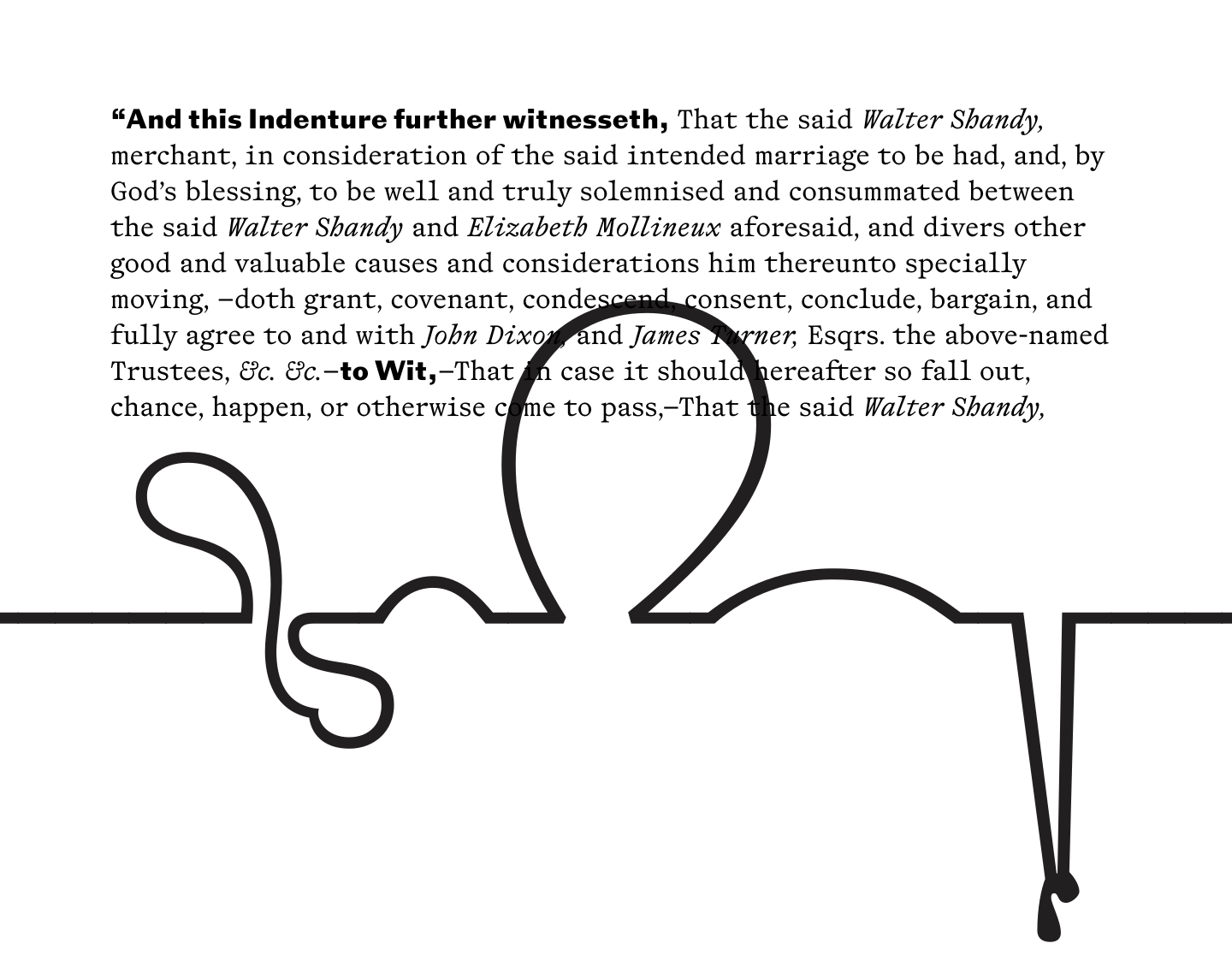
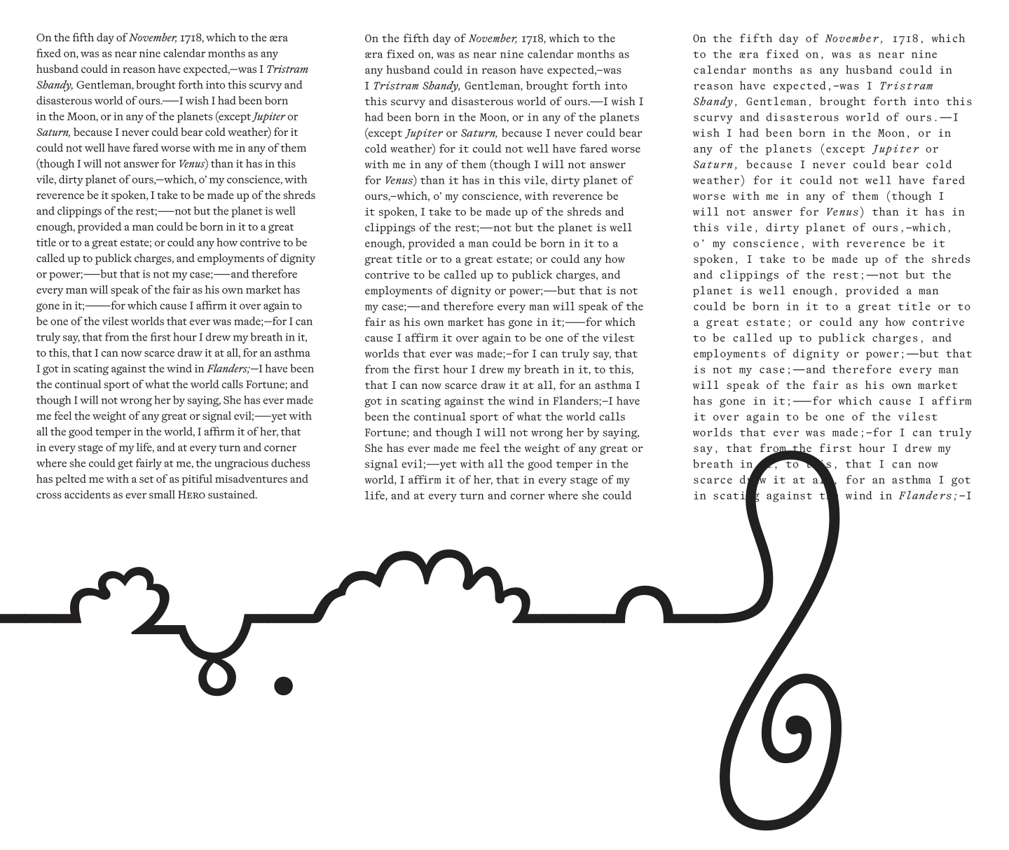
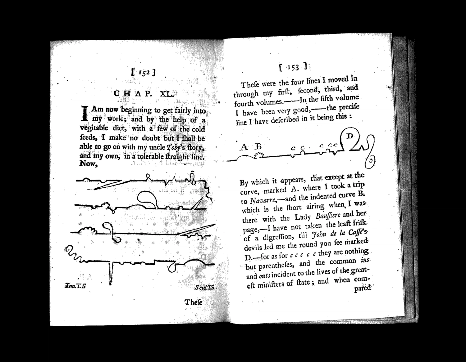
This doubtful meandering might be best illustrated by one of the cunning visual devices by Laurence Sterne himself. In volume VI, chapter XL of Tristram Shandy, the narrator attempts to get hold on the serpentines of his storytelling by introducing a series of diagrams demonstrating his literary excursions.

Digital versions of these “Shandean” storylines as shown in the specimen section above are available for licensing on request.

As a wise, pony-tailed man once said, type design is making all the effort to hide its methods. There is to me an astonishing, fundamental discrepancy at work here; a discrepancy between the sturdy confidence of the outcome and the oftentimes awkward affair that is the very process of designing type.

The Typefaces

Shandy ended up being a rather modest project. Several attempts on expanding the family with additional weights, optical sizes or grades either ended in doubt or despair. Initially due to a lack of ability, these trials later were turned down by impatience. Now, finally, after overcoming the omnipresent reluctance to finish and release, Shandy exists in three pairs of Book and Italick [sic!] type.

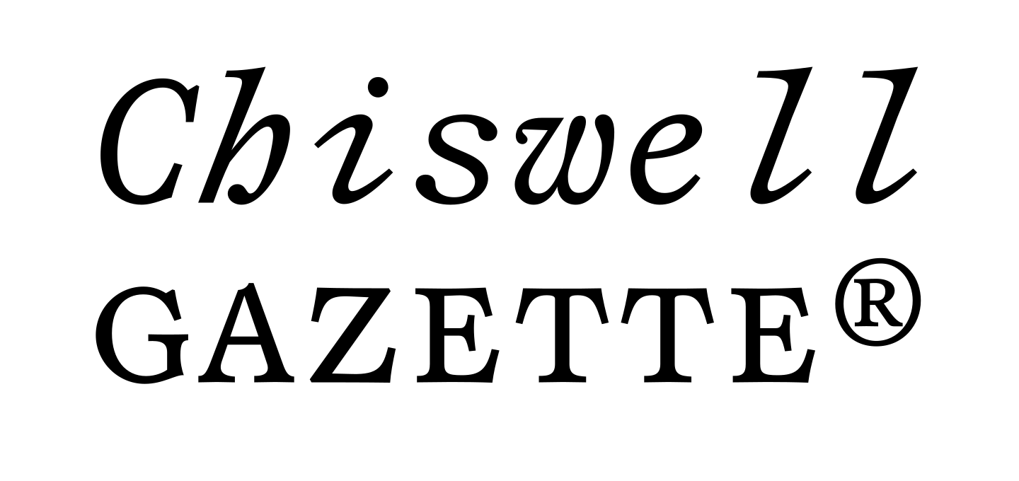
The Omni variant is a proportionally spaced, sturdy text face with low contrast, slightly exaggerated ball terminals and pronounced serifs. The Italick [sic!] is — what I would call — moderately dramatic, gooey yet digestible.

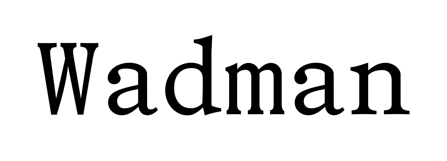
Shandy Poly sports the quirky shapes of a well-nigh monospace — especially notable in the forceful narrowing of wide letters like M, m, W and w and the extended serifs on i and l — re-spaced in a proportional fashion; a hybrid weirdo embracing the best of both worlds.

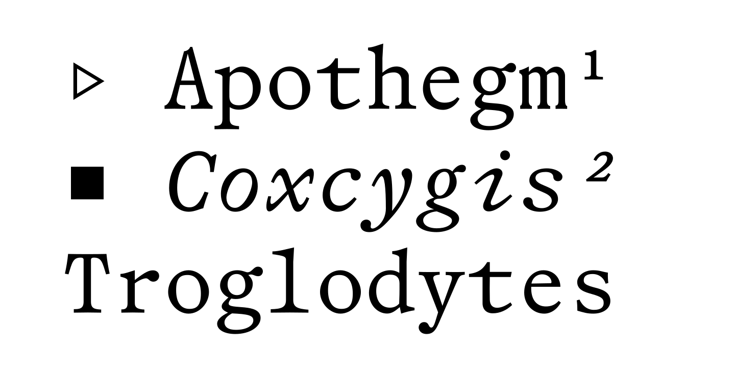
The Mono is — well — monospaced, with all the expressive delight and pseudo-functionality of a fixed-width typeface. I hear seriffed monos are quite popular these days due to their oozing of mechanical nonchalance, ¯\_(ツ)_/¯.

All three sub-families aim to combine a solidity with a subtle quirk, a high degree of curve tension paired with a fluid finish resulting in a firm, yet sparkling texture. If there is any of the whimsical wit of Laurence Sterne’s novel embodied in these typeface, nobody will or can ever proof. So if I tell you they do, you got little authority for counterargument. Cheers!

At this late point in the text, you, most loyal Reader might ask; did he — the pretentious designer of these typographic characters and author of this even more pretentious promotional gibberish — actually read “The Life and Opinions of Tristram Shandy, Gentleman”? And he will tell you that he did, and that the reading was almost as painful and lengthy as the designing of the typefaces.

In use

Not yet.

License

Shandy Omni Shandy Poly Shandy Mono License type License owner Company size Institution name E-mail


By proceeding you agree to comply with the End User License Agreement (EULA)

The Pyte Foundry ©opyright 2026

All rights reversed, all puns intended.